

Scrolling on your website can improve user experience
Finding the right balance in the amount of information on your website.
One thing we still hear often from new clients is, “Make sure there’s no scrolling on our website. I don’t like to scroll.”
We really question this thinking. Yes, it’s essential to have your most important content above the fold (being the theoretical cut-off in which the visitor has to scroll to start seeing more content); however, are we doing more damage by trying to squeeze every bit of information into a very small space? The answer is almost always yes.
Squeezing every piece of content above the fold could be compared to leading a customer into a room where a half dozen people yell at them simultaneously to get their attention. Who should they listen to? Which person has the actual information they are looking for? Do they feel welcomed and at ease, or confused, defensive and frustrated?
A good designer knows that content and design elements need room to breathe so the eye can focus on the most important elements first, like what your company does and its key selling proposition or message. If you make the right first impression, a visitor will know that you are qualified to help them with their particular need and have no problem scrolling to find more information because they know they are in the right place.
If you make the right first impression, a visitor will have no problem scrolling to find more information because they know they are in the right place.
Scrolling is Everywhere
If we haven’t convinced you yet, the thought that scrolling is bad is dated for a couple of key reasons:
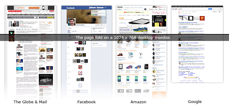
1. Many content-rich sites that people spend most of their time on every day require scrolling. Take a look at any search engine, news, shopping or social media experience. Since we’re spending most of our time on sites like these, we’re all used to scrolling to see the content. It’s second nature, we don’t even think about it. In the examples below there’s lots of valuable content below the fold. Trying to fit everything above the fold would be impossible and ineffective.
2. We all browse on different sized monitors. Before mobile devices, there were fewer screen sizes and designers/programmers could almost agree upon one universal screen fold. Now, with people using smartphones, tablets, laptops, desktops, and even TVs as regular internet consumption devices, each one has different capabilities and screen resolution. To go one step further, there is no set size on the millions of smartphones out there.
We’re not dealing with design for a physical space where we know the exact size of the canvas our content will fit. We’re dealing with canvases that are flexible and even infinite. Our content must adjust to fill them and with smaller screen sizes, scrolling is definitely necessary.
Proof that People Really do Scroll
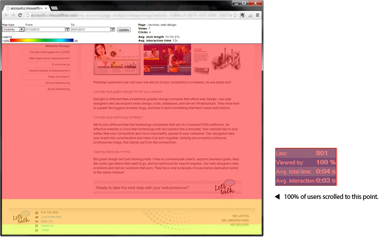
One of the great things about the web is that we can track how we interact with websites in an effort to make improvements. Using analytics software we can determine if users are scrolling to read content or abandoning long pages. In the example below the red area indicates the point on the page that 100% of visitors scrolled to. What you can’t see is that there is content above the fold, which means 100% of our visitors are scrolling to read the primary content on this page.
So where does the ‘no scrolling’ expectation come from? My guess is that people have gotten used to the print design process and they don’t think about their actual browsing habits on the websites they visit daily. If you are personally in the habit of scrolling without thinking, odds are the visitors to your site browse with this behaviour as well.
Embracing the Possibilities
Designing for the screen is not like designing for print. We have different restrictions on screen, but we also have different possibilities like video, motion, and sound, as well as a real-time marketing tool that can be immediately updated and expanded for a lot less cost. We should use this flexibility where it’s appropriate to meet all of our customers’ informational needs while enhancing their user experience. Imagine if a print piece could have scrolling so you could add more content than would physically fit on the paper? Most would think it was a great idea, so why doesn’t this attitude carry over to the online environment where scrolling is expected and regularly used? The answer is to embrace scrolling for the benefits it can bring to the user experience.