
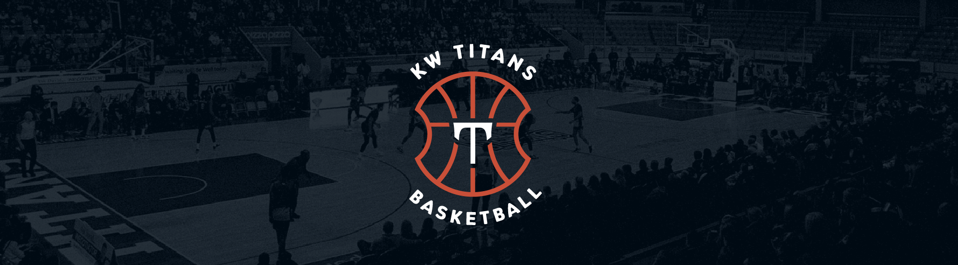

KW Titans
Waterloo Region’s professional basketball team, the KW Titans, as part of their preparation for their 9th season partnered with us to rebrand the sports team.
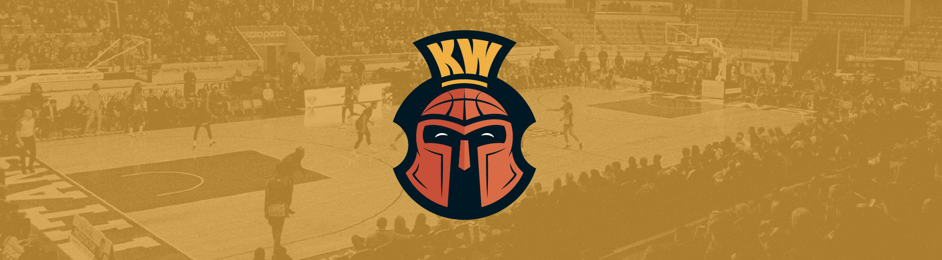
The original logo, created for the team 8 years ago, has received minor tweaks over the seasons to work better for marketing, digital ads, and reproduction on various merch. Even with the updates, it didn’t reflect the quality in the level of play, nor did it reflect the energy felt on the court.
Rebranding a team needs to be authentic to the sport, the culture, and the fans. Digging into the team’s culture, the Studio Locale team interviewed coaches and players, to understand what gave the team their edge, how they approach their game and what they felt might be missing. Guarding their house, bringing the heat and tightening up, along with the level of ball that they are committed to came up from all from everyone we spoke with.
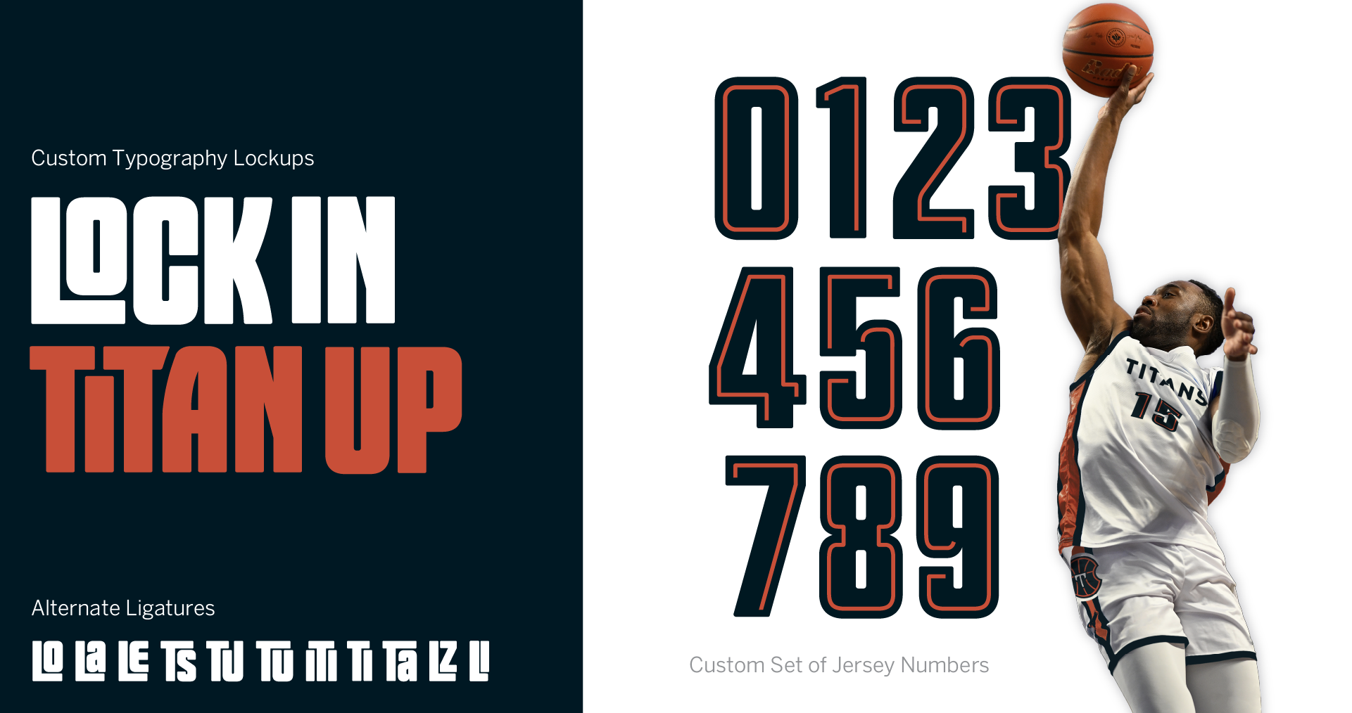
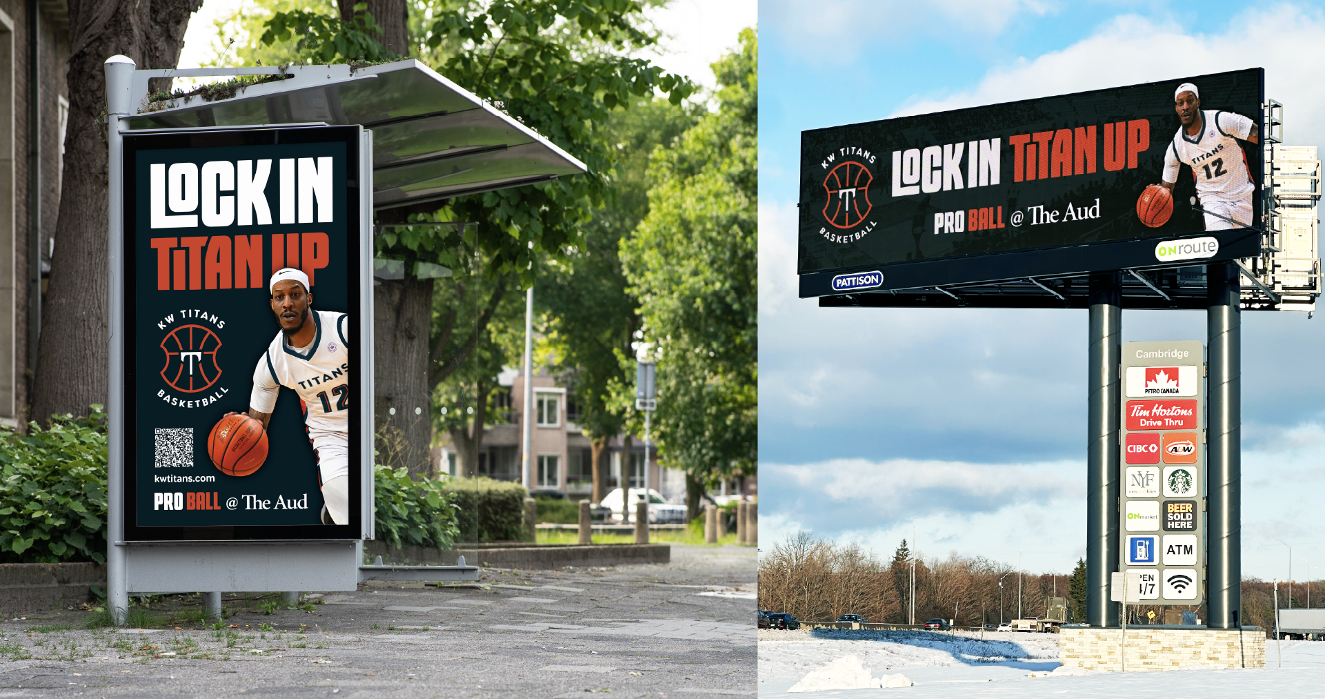
Using the team’s own language, “Lock In, Titan Up” was quickly identified as the rally cry for the team and fans alike.
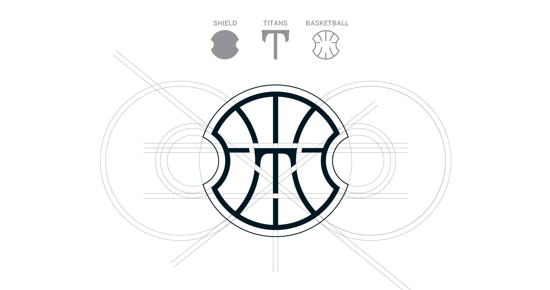
Then for the logo, not wanting to leave all of the team’s history behind, we started exploring the shield element from the previous version. The aegis shield is a classic form or shield shape that many recognize as a circle with notched out sides that, when multiple shields are locked together, allow a spear through – in other words, they tighten up and lock in when facing their opponents.
ClientKW TitansDisciplineBranding, MarketingProject TeamAnneta Wamono, Erynn Hayden, Jessica McLachlan, Philip Mondor, Robin Mondor