

Pioneer Craftsmen Case Study
Breathing new life to an established brand
The Backstory:
For over 65 years, Pioneer Craftsmen has been one of Waterloo Region’s foremost design-build home renovation companies for clients who value exquisite design, quality craftsmanship, and exceptional service. As a third generation, family-owned company committed to improving everything it touches, Pioneer felt it was time to update its branding and website.
When Ken Adam founded Pioneer Craftsmen in 1953, he chose the Pioneer Tower to be the main focus of the company’s logo because it was an iconic local landmark (built in 1926) that represented Waterloo Region, its heritage, and stood the test of time thanks to great craftsmanship. These values were the same ones he wanted to instill in his new venture.
Although Pioneer’s logo subtly evolved over the years, it always maintained the traditional-styled tower illustration. While Pioneer cherished the family roots associated with this key design element, it was making the company’s identity appear traditional and dated. It was not indicative of the modern design and craftsmanship solutions Pioneer was offering its clients today.
The company’s website had also reached a point where it was time for an overhaul. While all of Pioneer’s award-winning projects were showcased, the visual design of the site was beginning to look dated, and the messaging was light on portraying Pioneer’s personality, proven process, and how it was different from other renovators.
The Ask:
Refresh the company’s logo with a modern look/feel to better reflect Pioneer’s forward-thinking design, elevated craftsmanship and approach, while keeping the tower icon in place to avoid losing any brand equity built over the last 65 years.
Develop a new tagline that clearly communicates how Pioneer’s renovations are different from its competitor’s; a slogan that only Pioneer can take ownership of given its strengths and reputation.
What We Delivered:
Logo
After conducting some research and developing an updated strategic brand plan, we got to work on refreshing the logo. It began with modernizing the style of the tower icon and ensuring it remained a recognizable landmark. Grey was chosen to create contrast with the rest of the logo and act as a secondary visual focus to Pioneer’s name. Next, the logo’s dark burgundy colour was replaced with a lively tone of red to add brilliance and vibrancy. Contemporary fonts were carefully selected for Pioneer Craftsmen’s name which blended serif and sans serif styles.
The wordmark was then thoughtfully integrated with the rejuvenated tower icon to create a fresh, beautifully balanced identity. The final logo successfully expresses Pioneer’s forward-thinking design and craftsmanship, while still paying homage to its founder and the beacon of lasting quality he wanted the company to be known for.
Tagline
Based on the brand plan and Pioneer’s positioning, “Different by Design” was developed as the new tagline. It clearly communicates what clients can expect when choosing Pioneer Craftsmen for their home renovation partner. The phrase immediately and successfully resonates with the company’s target market; those looking for something unique and far beyond the average home renovation. Not only does it place great focus on Pioneer’s unparalleled ingenuity and design solutions (which competitors typically contract out), it also reflects how the company’s approach has been designed to be purposefully different.
All of Pioneer’s projects are design-build, so its cohesive team of in-house designers and carpentry craftsmen can collaborate to develop (and build) the best design solutions. Using a proven four step process, Pioneer effectively takes the guesswork and unwanted surprises out of large home improvement projects for clients and replaces them with truly enjoyable experiences.
Pioneer also works differently by assigning a lead carpenter who is solely dedicated to one project. Combining this with its full-service capabilities ensures clients never have to play traffic coordinator between trades or be a budget master (like using a general contractor would require). Clients have peace of mind knowing there is one source, one responsibility for their home renovation and that they are in excellent hands with Pioneer Craftsmen.
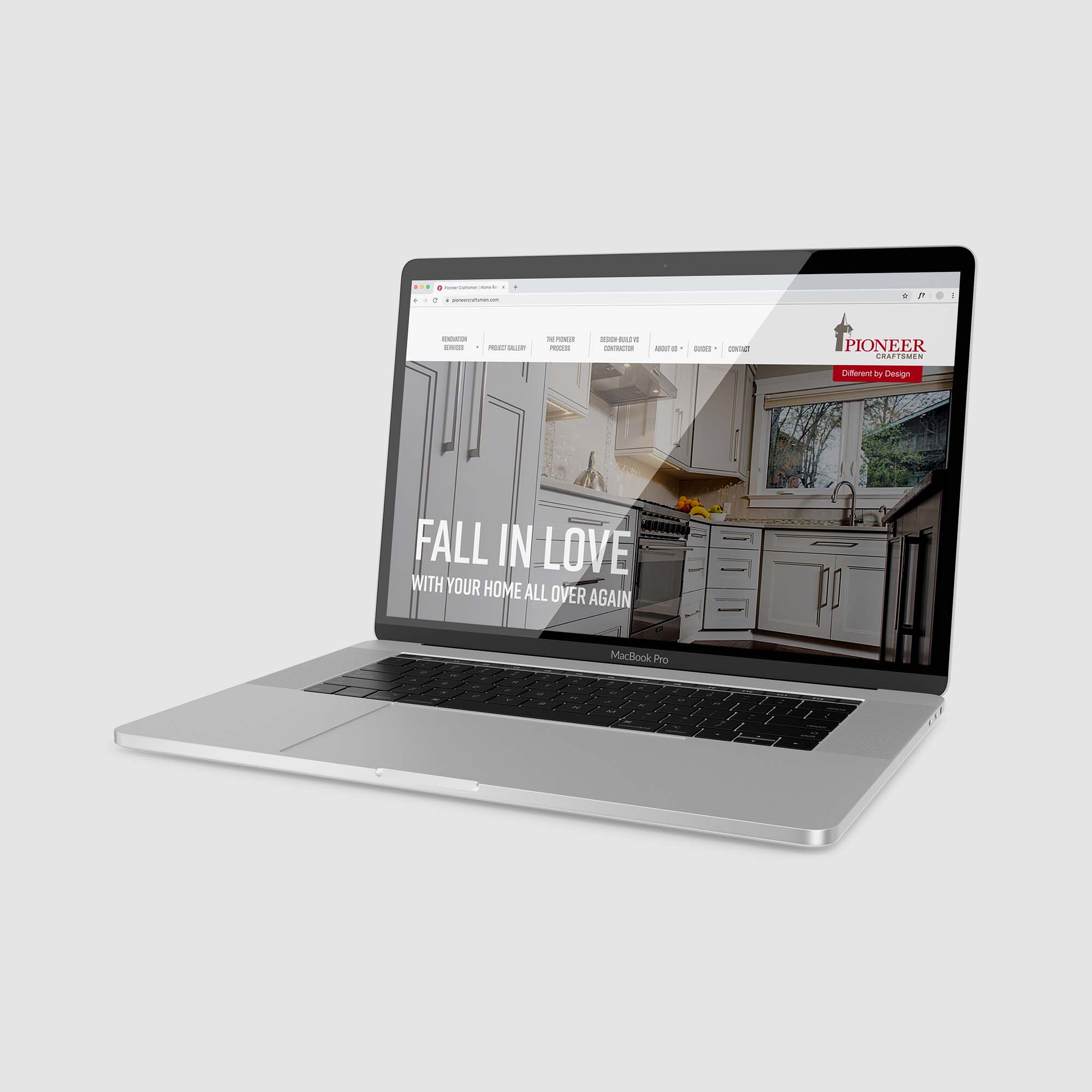
Website
As the team works so transparently with their clients, it only made sense that the website should reflect this approach. With this in mind, Studio Locale worked with Pioneer to build an on-line experience that would clearly convey what clients could expect working with Pioneer.
The new website is rich with content, thoroughly outlining their process and showcasing completed projects. Each page takes visitors on a journey, from imagining the possibilities of a renovated space, to the completed project.
Supporting videos provide examples of what clients can expect working with Pioneer through each phase of the project, demonstrating the care all of Pioneer’s team members take to provide the best possible experience.
What Happened Next:
Pioneer’s new logo and tagline were rolled out across a variety of marketing pieces including stationery (including business cards, letterhead, envelope, e-signatures, note pads, thank you notes), roadside signage, vehicles, staff uniforms, newsletters, and the website.
The new identity has been a great success! Stakeholders are thrilled with the modern logo that stays true to the company’s roots, returning customers (who knew the original logo well) love the new look, and Pioneer’s staff continue to wear their uniform shirts with immense pride.
The website has been an extremely valuable marketing tool as well. Through strong SEO tactics, a comprehensive lead generation form, and the overall elevated experience, Pioneer successfully fills their team’s schedule with right-sized projects.
With comprehensive research, strategic marketing, and engaging visual design, Pioneer’s refreshed brand will continue to forcefully position them as Waterloo Region’s premier renovation team for many years to come.
“There was some concern for me at the very beginning of the process, but that concern was quickly overcome once I saw the depth you were proposing to go to learn about our company, our process, and what makes us different. From the initial meetings at our office reviewing our process with our team, to actual phone calls with our sales team playing the role of potential client, it was clear that the team at Studio Locale truly wanted to know the journey we take our clients on.”
Jamie Adam, President
Pioneer Craftsmen
Industry
Home Renovations
Discipline
Brand refresh, tagline, website, marketing materials
Project team
Anson LeClair
Erynn Hayden
Phil Mondor
Janice Powell
Contributors
High Rise Studios
Mike Powell

February 11, 2025
Managing your online product catalogue through your website

November 20, 2023