Colour influence and perception
It’s a black & white world. Blue is blue right? Well now that depends.
Colours, like teenagers, can be tricky business and be easily influenced by other colours around them.
Josef Albers Homage to the Square series is based on the realization that colour only exists within the context of other colours. That what we may know about colours, and our understanding of how they will react with each other, is something that is not always easily predictable.
Albers shows us this – the two small squares in plate 1 are the same colour. The colours he chose to surround it heavily influenced how it appears to our eyes. The small square at the top appears to be a lighter brown than the one at the bottom.
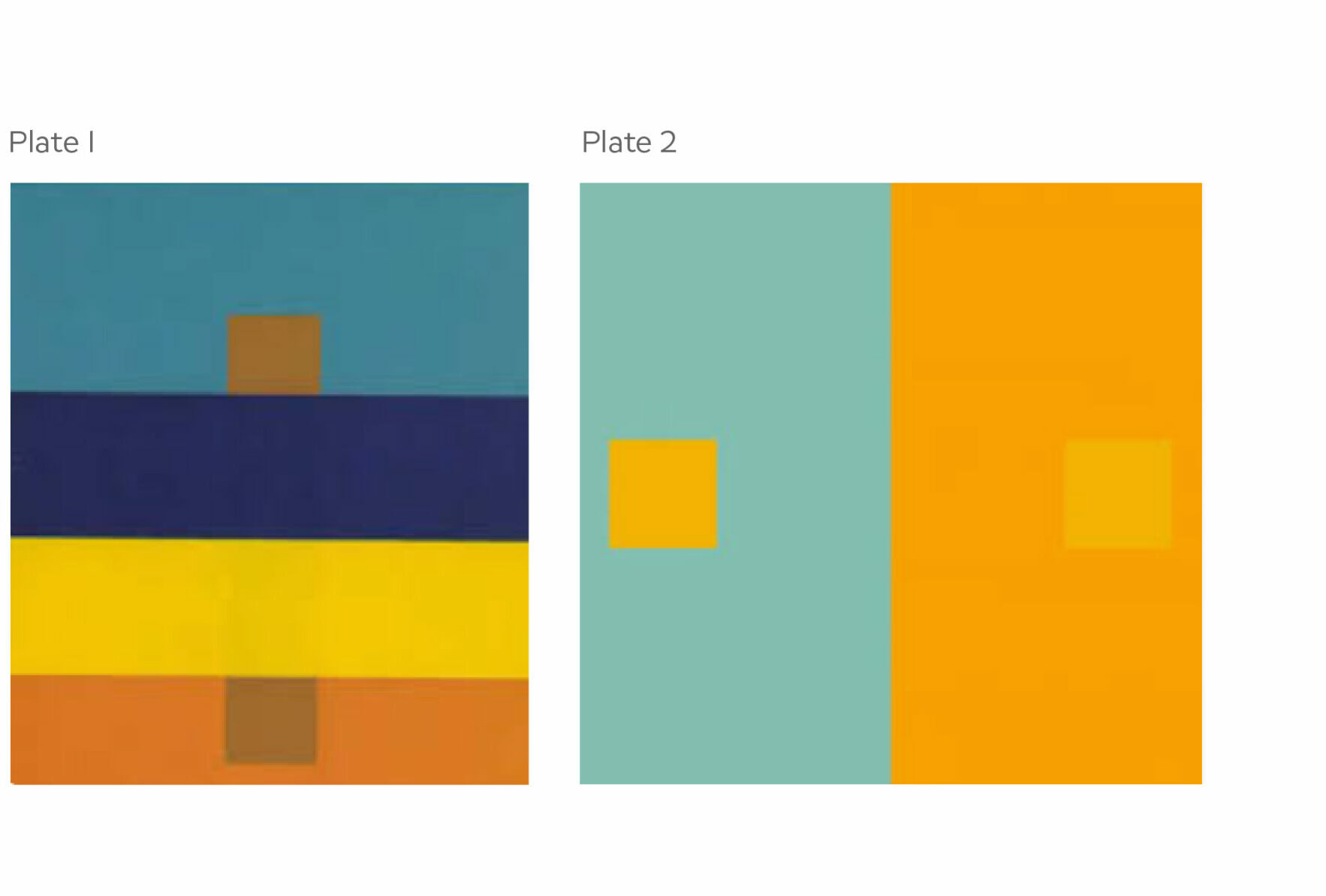
The same goes for Plate 2. Here the small square on the left looks to be the same colour as the surrounding orange to the small square on the right. Hard to believe the small squares are exactly the same colour.
Influencers I tell ya …
Individual perception is also really important. You and I don’t see colours the same way, even when they are in isolation from other colours. Have you tried the test visual neuroscientist Dr. Patrick Mineault created? It maps how we see blues and greens differently from each other. Even with the professional eyes in our studio, we saw the two colours differently.
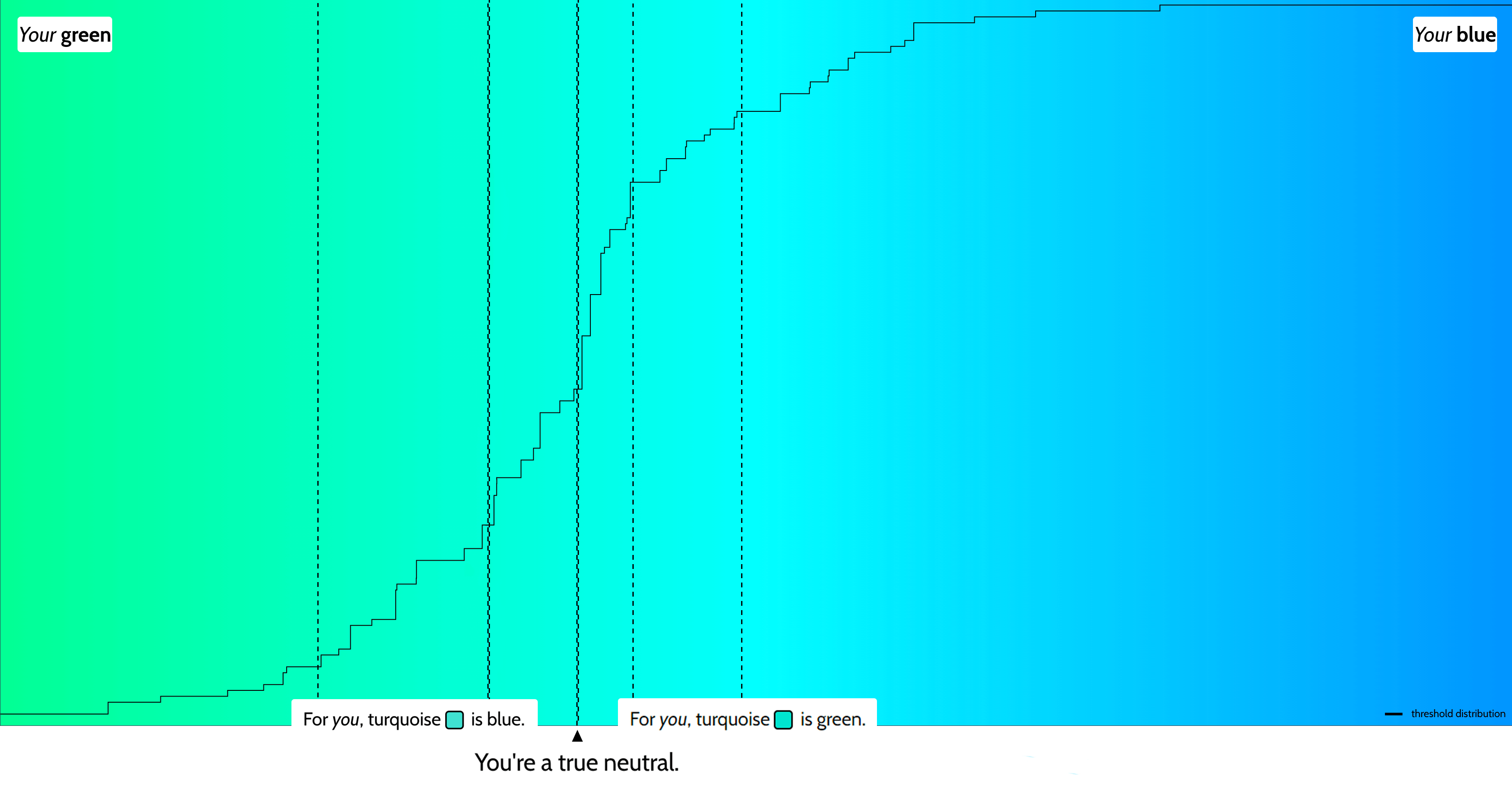
So the next time you are looking at colour, whether for your branding, marketing or your living room and talking with others about the colour, remember to keep the gloves on if others see it different from you. Blue is not always seen as blue. We don’t all see it the same way.

June 3, 2025
The Quiet Power of Good Signage
May 14, 2025
Fighting sameness
October 3, 2024


