
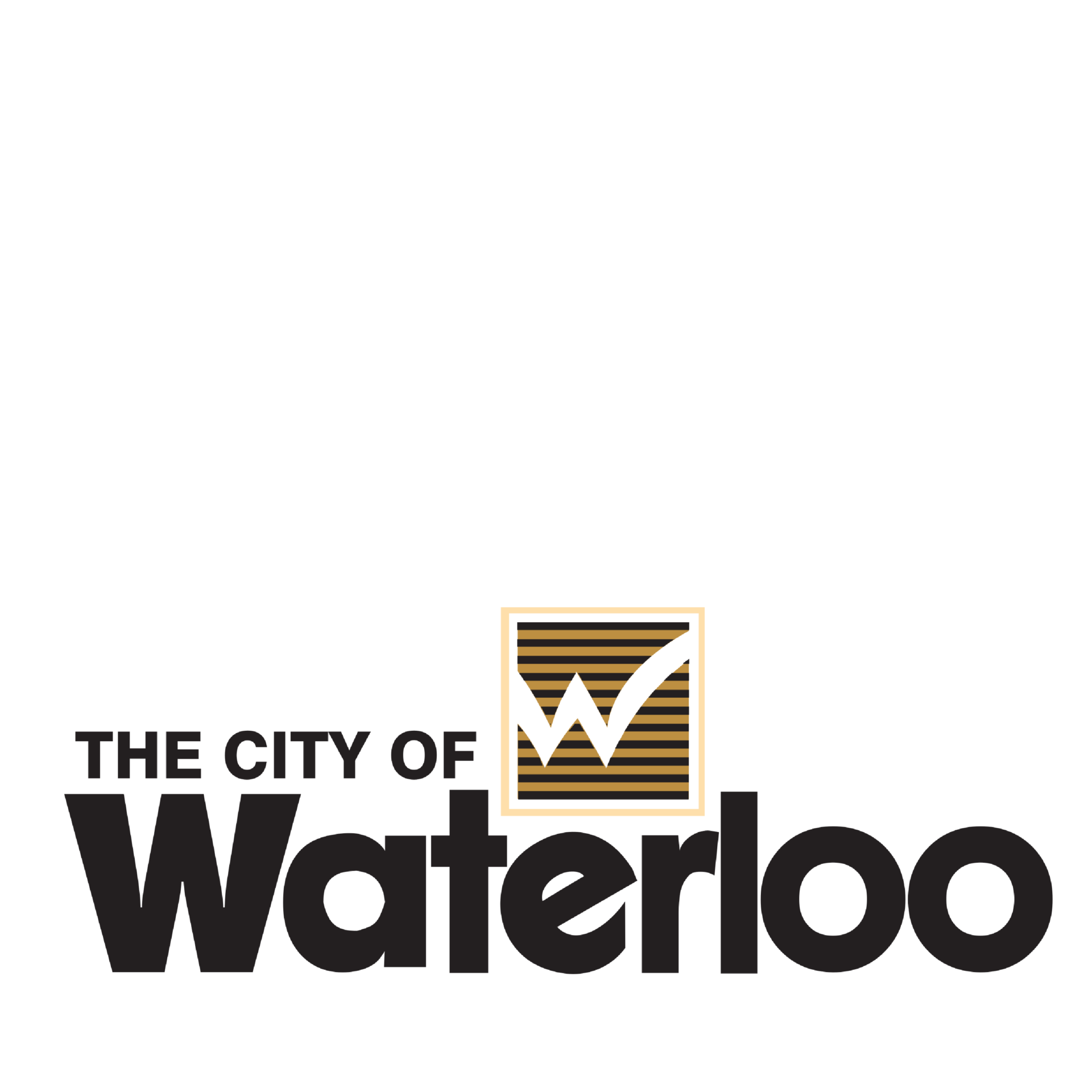
City of Waterloo Rebrand
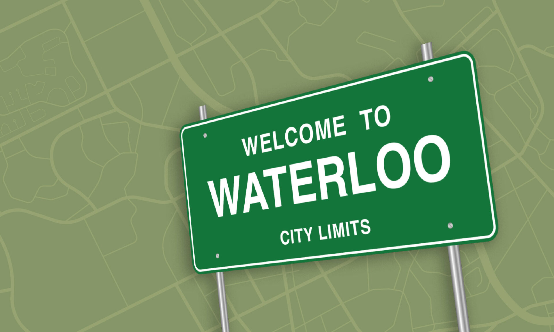
Did you hear the ‘City of Waterloo’ rebranded?
We all rushed to take a look.
To our surprise, the new brand wasn’t for Waterloo, Ontario but instead Waterloo, Iowa. Oh. False alarm.
Like many people, we’re excited to examine a logo refresh to see the new face of a brand and weigh in on it. As designers, we look to understand how it reflects the brand’s values and resonates with the target audience.
When it’s a brand we have a personal connection with, we can sometimes be more critical of it.
You might remember the negative attention the University of Waterloo “lasers” rebrand had a few years back. It seemed like everyone had something to say. The feedback was so negative that the design was pulled and returned to a fairly safe refinement of the traditional coat of arms that UW is known for. When it comes to brands, it seems that everyone has an opinion.
But this article isn’t about what we think about the new brand for Waterloo, Iowa. Upon discovering this “other” Waterloo, we thought that it’s rare that we have the opportunity to look at how multiple organizations (in this case cities), with the exact same name, brand themselves differently.
Do they look exactly the same? Does each brand evoke a different feeling that represents the aspects of the place and people they represent? How do cities choose to represent themselves? Is it history, geography, reputation?
Turns out there’s a Waterloo in Illinois and of course the one in Belgium that all have unique brands. So we thought it would be interesting to look at all four together.
Why Do Cities Have Visual Brands?
Before we take a look at the brands and how they compare we think it’s important to consider why cities have brands.
#1 with a bullet is of course to send you official looking letters, like property taxes, that you feel compelled to pay. But all joking aside, there are a few reasons.
- To represent the people and communities that live there
- To attract tourism and business
- To attract people to move to the area
- To build a reputation and be known for something
- To look official, build trust, and respect
- To identify municipal services
Although branding includes much more, we explored the visual brand identities of the 4 Waterloos. What does each city’s visual branding look like?
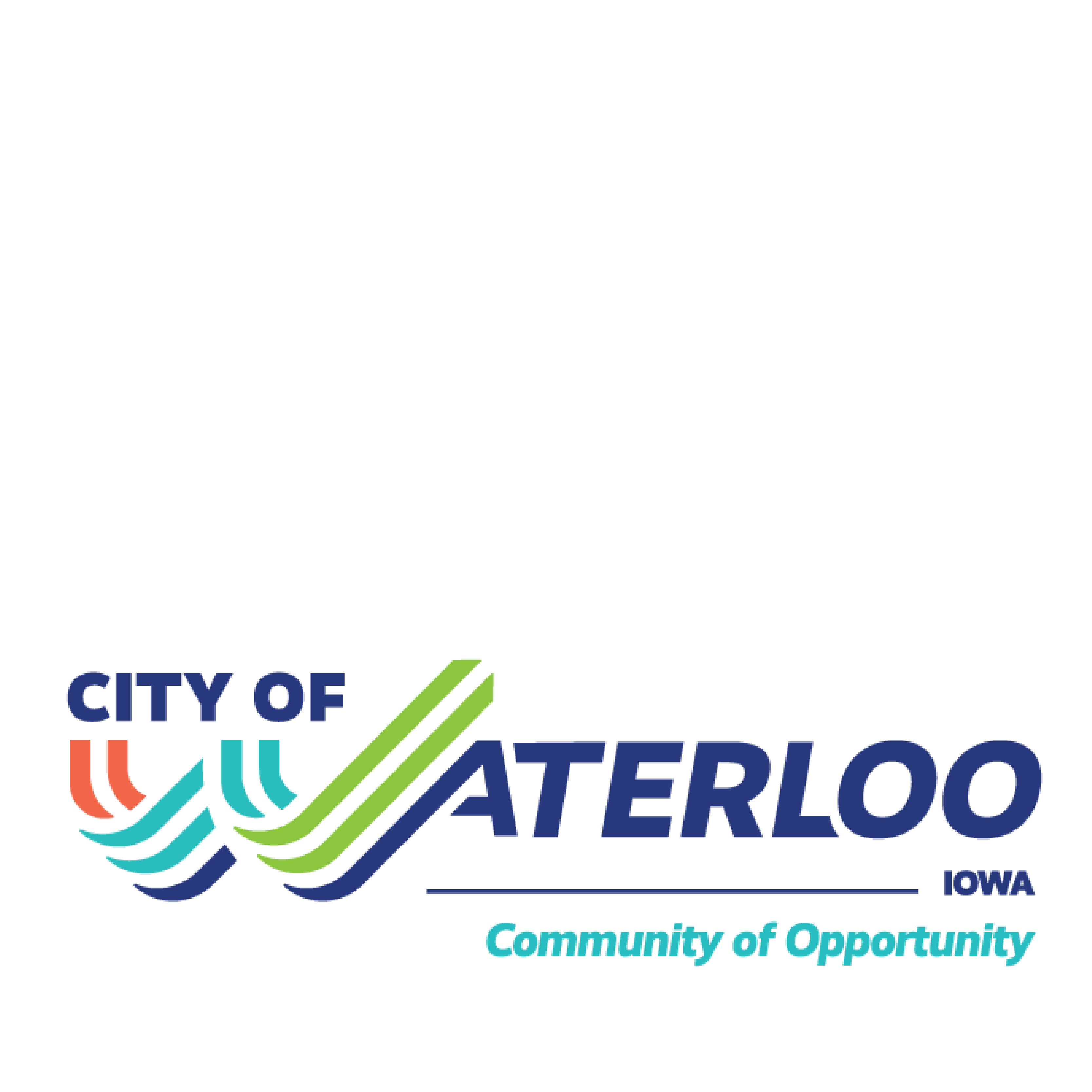
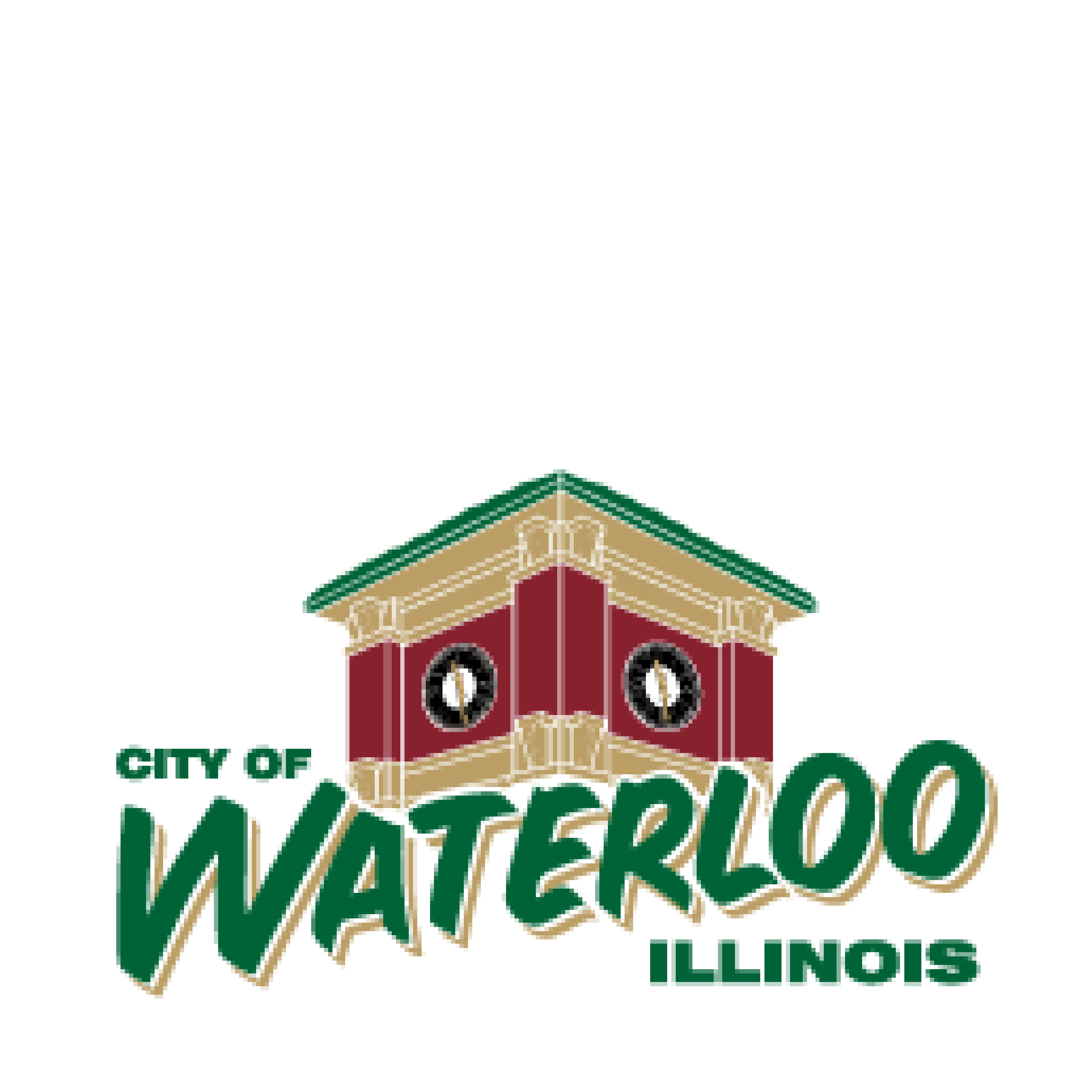
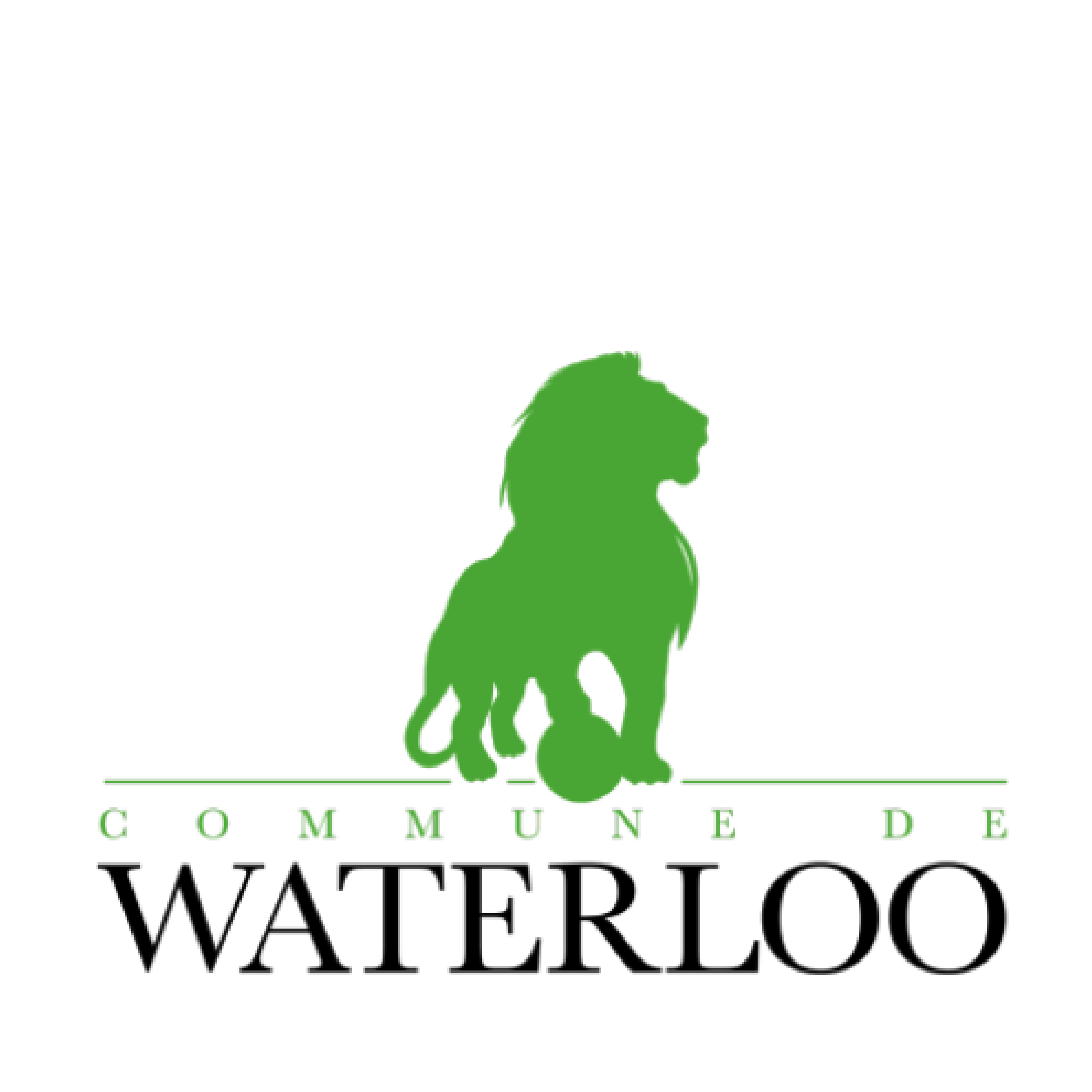
And what does that say to us?
- Energy
- Fresh
- Bright
- Welcoming
- Historic
- Tradition
- Powerful
- Proud
- Modern
- Technical
- Corporate
- Bold
Having seen all four cities’ brands, what do you think? Which would you most like to move to, visit, or work in? Does the way each city is presented inform how you think and feel about these places?
We’d love to have you weigh in. Share your thoughts with us.
Or if you are looking to rebrand your city, our door is always open. Please reach out and we can chat.