Have you ever landed on a website so strange or jarring that you had to pause and take a second look? That might be the point.
Brutalism in web design is gaining traction and it’s sparking conversation about what designers are really trying to achieve. Are they chasing shock value, or are they genuinely striving for stripped-down functionality? In many cases, it’s both.
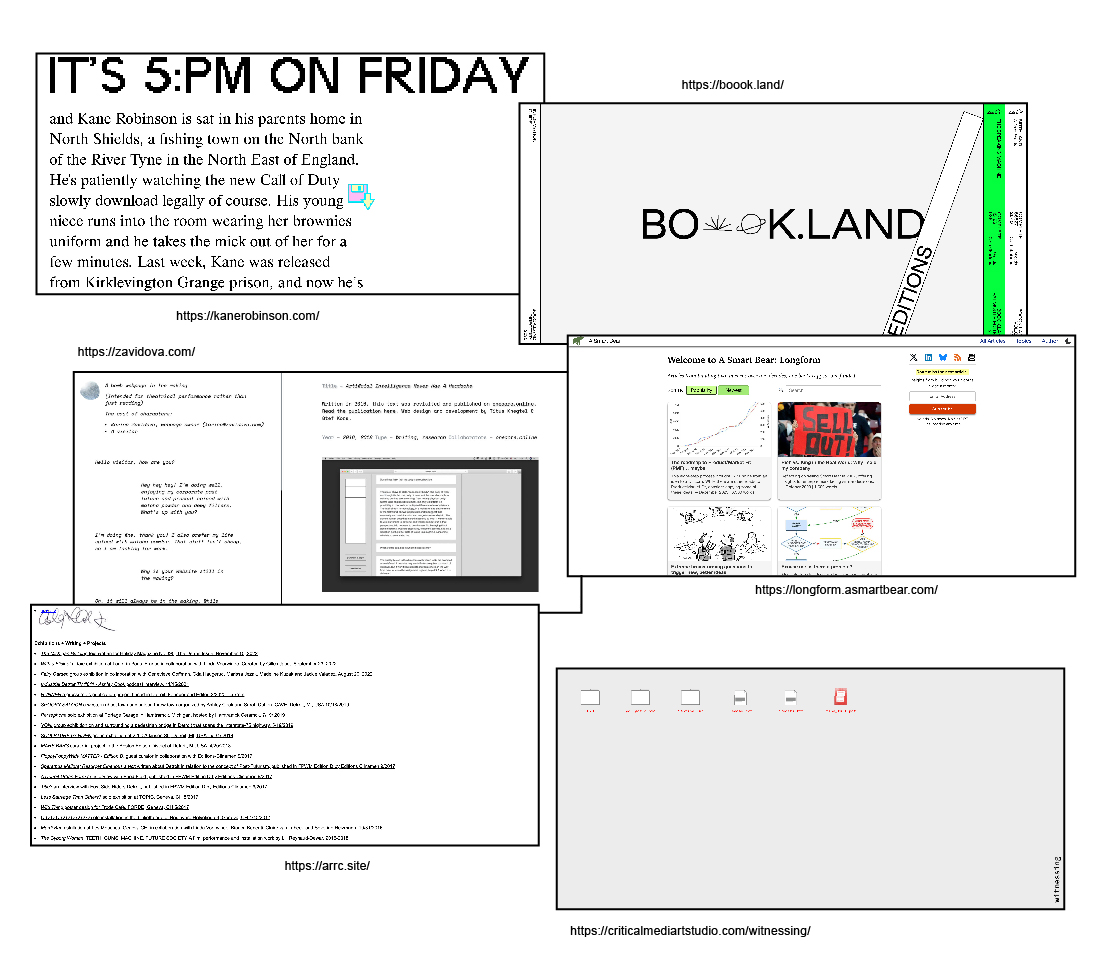
These sites reject the sleek, polished interfaces we’ve grown used to, opting instead for raw aesthetics, stark typography, and intentionally harsh layouts. It’s a rebellion against convention, but it’s also rooted in something surprisingly practical: function.
With the average user only waiting two seconds for a site to load, many people may never even see those beautifully curated designs. So how can we combat ever-shortening attention spans?
Because brutalist sites don’t rely on elaborate graphics or animations, they often load faster. And get this… making your site look “worse” can actually improve SEO, reduce bounce rates, and get users where they need to go with fewer clicks.
Of course, it’s not perfect. Brutalist design can feel hostile, unwelcoming or simply confusing.
So, the real question becomes: Where’s the line between radical simplicity and just plain bad design?