


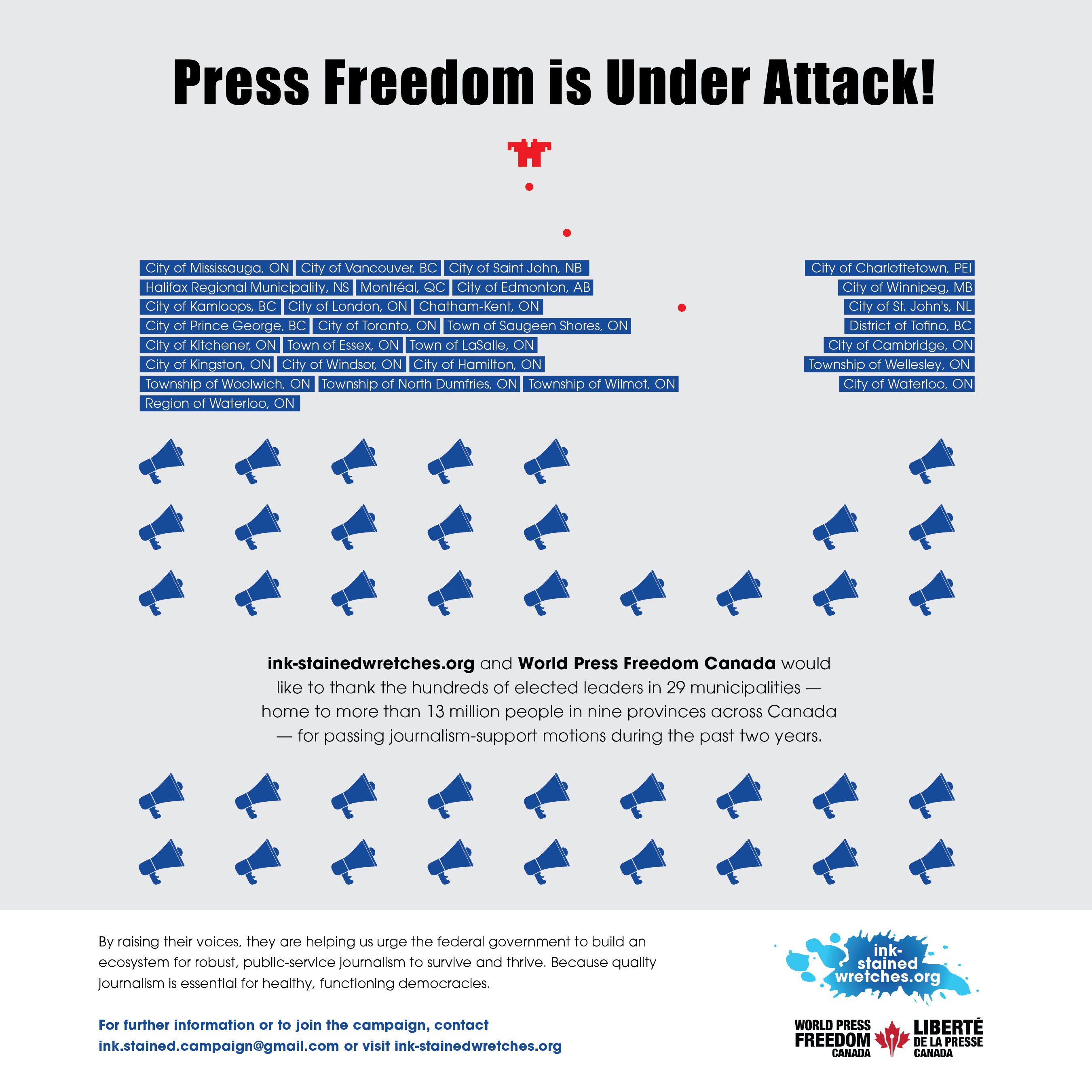
Gold Quill Award for Ink-Stained Wretches Ad
We won an award!
Our ad for Ink-Stained Wretches supporting local journalism received an IABC Gold Quill Award of Merit in the Government Relations/Public Affairs category. The ad ran to thank the 29 municipalities across Canada that have passed journalism support motions and encouraged others to join, helping them spread the word about UN World Press Freedom Day.
Mirko and the rest of the Ink-Stained Wretches have been working tirelessly to support and advocate for local journalism in the face of sometimes undemocratic and hostile environments.
It’s a nice feather in our cap! (pun intended!!)
Digital marketing to improve sales
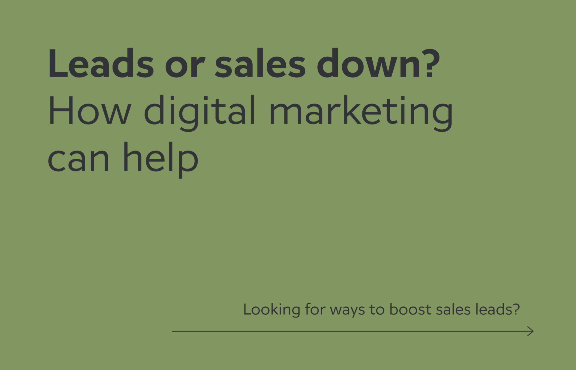
Leads or sales down? How digital marketing can help
Looking for ways to boost sales leads? Digital marketing may be able to help. There are a number of different tactics that you can use to present digital ads and communications to potential customers – both before they need your services, or right at the moment when they are looking for help.
Digital marketing will:
Present your brand at the moment where your prospective customer is looking for a solution
Present your brand as a solution for a specific problem you can help solve
Present your brand before your services are needed to build brand awareness
The most common digital marketing tools include:
Google Ads
Usually the first obvious tactic that companies will identify is Google Ads. Creating a Google Ads campaign that targets customers looking specifically for your services. It presents your solution at the moment they need it. They have already identified a problem, know that they need outside help to solve it, and are ready to invest. Creating and then managing your Google Ads campaign can help feed your sales funnel and build overall brand awareness. Not sure where to start? You can learn more on how to improve your Google Ads campaign from our team here.
Digital Banner Ads
Digital banner ads are an excellent tool for building brand recognition. You can control the sites ads are shown on, when they appear, and how frequently they are presented. Selecting the right approach that matches your target audience will build brand awareness over time. Banner ads can also be presented to match when your potential customers are looking for your products or services. Similar to Google Ads, you can also control the geographic area for where the ads are shown, so you are presenting ads only to customers you can actually support.
Social Media Ads
Depending on your product or service, social media ads can be an effective way to connect with prospective customers. Understanding your target audience and which social channels they are actively using, you can determine if it’s worth your marketing budget to run ads on social channels. (Some social media platforms are also struggling to be seen as trustworthy, so something else to consider before adding social to your media mix.)
Email marketing
When done well, email marketing can be an effective way to keep in touch with your customers, encourage engagement, and keep brand awareness top of mind. There are a few different strategies you can use to approach your email content. Whether you use it for updates on products or services, insights on industry trends or challenges, or loyalty offers, it’s a good way to connect with your audience. And with brand-owned platforms seen as more trustworthy compared to other social media channels, email can be a strong element in your media mix. (Not to mention cost effective!)
With the right mix of digital marketing and advertising, you can build a healthy sales funnel for your sales team. If you are curious what that might look like for your organization, we’d be happy to help you develop a media mix plan and calendar to get you started!
The cost of building a marketing team vs. hiring a marketing agency
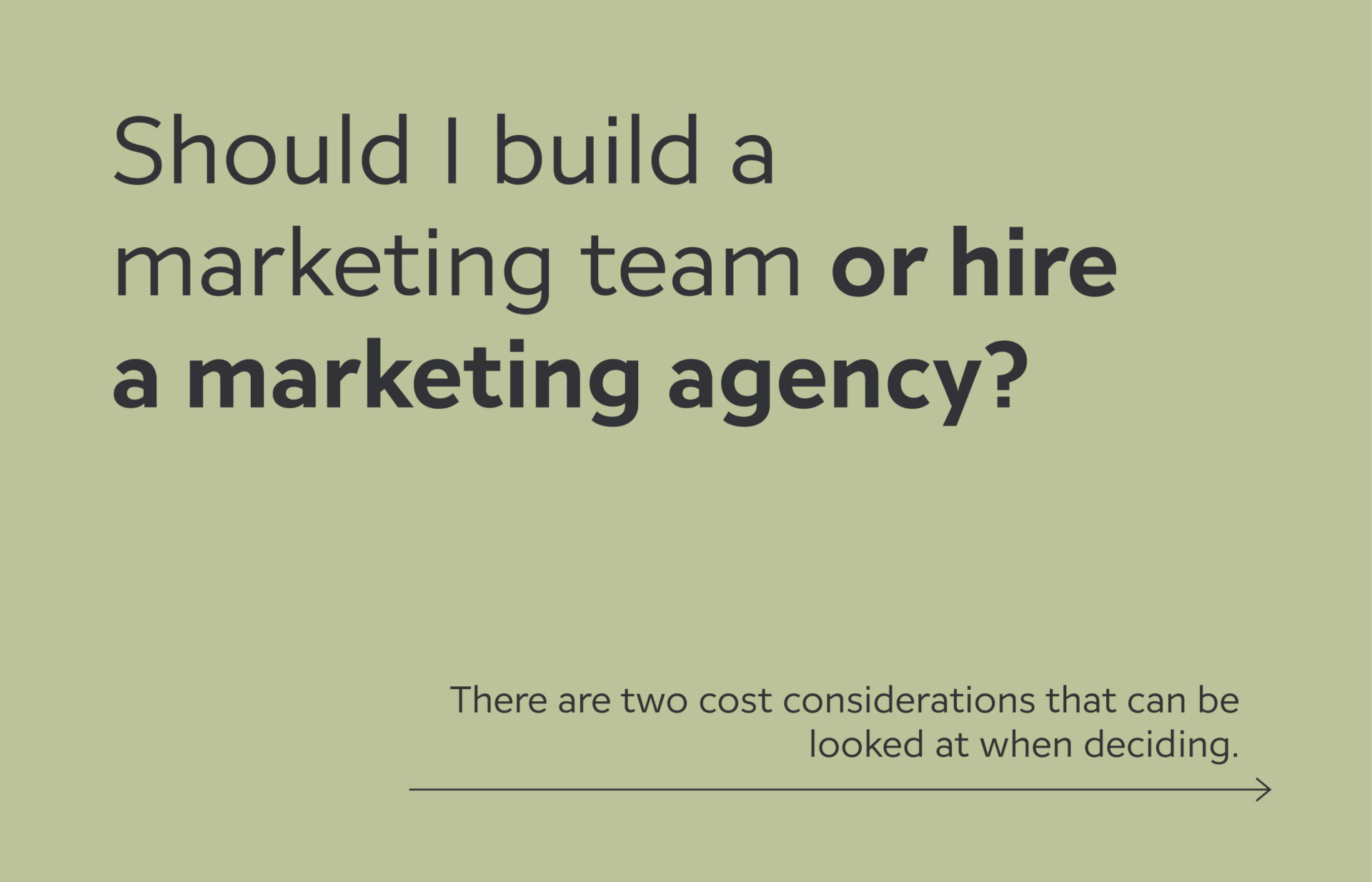
Should I build a marketing team or hire a marketing agency?
This is a question many business owners or marketing directors may struggle with. As their business grows and they need to build out a more comprehensive marketing strategy, which approach is the most cost effective, building a marketing team or hiring an outside marketing agency?
There are two cost considerations that can be looked at when deciding what makes sense for your organization – hard costs and time costs. Looking at both of these before making a decision should prevent any surprises down the road.
Hard cost comparison
These costs are the most obvious to compare when looking at building a team or hiring an agency. On the internal marketing team side, hard costs include things like salaries, benefits, equipment and software licensing. We’ve used the average salaries from RGD’s 2021 salary review for the key team members you’d need on your team.
When hiring a marketing agency, there is typically a defined scope of work for a specific time period for an agreed to cost. For our comparison, we’ve used the example of a multi-channel marketing campaign, typically executed over 12 months.
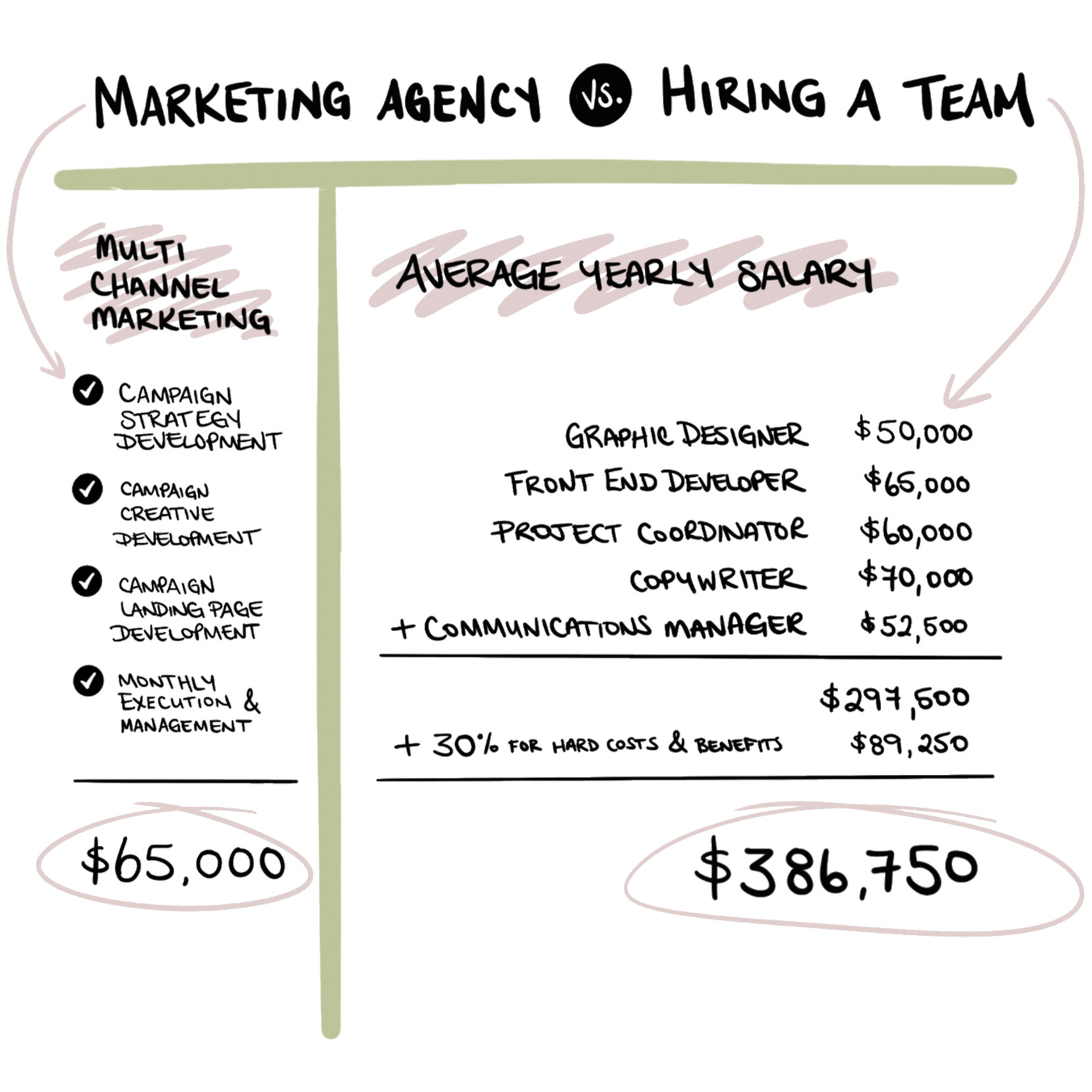
Of course the internal team could work on other projects over the course of the year, but would likely still come in higher than if you hired an outside agency for the same work. Internal marketing teams are most effective when there are multiple, continuous marketing initiatives each year.
Time cost comparison
Time costs are a little bit harder to quantify than hard costs. These are costs associated with the hiring process, training, and ongoing management of an internal team vs the initial engagement of an agency plus any regular touch points.
Looking at the internal team side first, here are few things to consider.
Hiring a team takes time
These are the typical to-do’s when adding a new hire to your team:
- Create the job description(s) and posting
- Post / share / pay for the position to attract applicants
- Sort through all the CVs sent your way
- Interview the top candidates (assuming you can qualify all of their skills)
- Onboard them into your organization
Also keep in mind, during this time you are less focused on any actual marketing initiatives on the go and may lose some of the momentum you’ve worked hard to gain.
Maybe freelancers would work?
There are a high number of qualified freelancers out there that you could contract to deliver a specific component of your marketing executables. Keep in mind that means additional coordination on your end to make sure everything aligns and works with the other freelancers for a cohesive campaign. Rather than focusing on your marketing initiatives, your time may be spent organizing review meetings with different individuals, all with varying schedules, to keep everyone on the same page and on track.

Be wary of unicorns
Wouldn’t it be simpler if you just hire one marketing manager or specialist that can do everything you need? They can write snappy copy, design eye-catching materials, create informative infographics, develop new pages for your website, integrate a media campaign and track the results of everything. The reality is that finding all of that in one person is highly unlikely. Each of those require unique skill sets. And if someone says they can do all that, we’d recommend doing some serious reference checks.
On the agency side, there is still time required to kick things off. This is needed to make sure your chosen agency understands your goals, challenges and the competitive landscape. A good agency will see themselves as an extension of your team and will want to learn as much as they can before building out their approach. (Unsure where to start in selecting an agency? These are our three tips when it comes to picking a marketing partner.)
From there, depending on the project, there may be regular touch points to go over progress, as well as monthly reports or reviews to look at results. The agency should be taking the lead on these updates and making necessary adjustments as you go.
We Were The Client!
The makings of a memorable video
We recently created a video as part of RDG’s cross-country studio tour – an inside look into the creative spaces and teams developing brands and creative communications from coast to coast. As a studio, we knew we wanted something other than the typical ‘real-estate’ style tour of our space. We wanted something that would not only stand out from the other tours, but also be used to introduce our team to new clients. So we reached out to our friends at Astrodog Media to work together on creating a not-so-typical, memorable studio video.
After completing our tour video, Robin & Phil sat down with Matt from Astrodog to talk about the overall experience and how they help clients be the best representation of themselves.
R – Let’s start at the beginning of a project, even before production gets started. What’s Astrodog’s secret sauce/approach to creating videos?
M – We love when teams bring us a creative brief and ask “How would you approach it? What are your suggestions?”. Our approach is a 3 step process, where we start with discovery/diagnostics to learn about the client, then strategy where we look at reference and inspiration to determine tone and feel, and finally creative development that includes the final narrative outline. The output of this process is the creative package, that fully outlines the project production. It gives us a reference to come back to should there be any changes to direction mid-project as to the objectives of the final piece.
P – Everyone has a process. Talking about the process can be boring, but going through it, you realize the work that goes into it, and why it’s so fundamental to the final piece.
R – It sounds similar to our website development approach, where we dig into our client’s business and understand what they need their website to do. It pulls back the curtain a bit for clients to see what goes into a successful project. There are so many different pieces and requirements to be considered.
It can be hard to look at ourselves. So it’s good to have someone help you see yourself from an outside perspective.
M – So here’s a question for you – what did it feel like being on the other side of the table as the client?
P – It can be hard for designers to look at ourselves, and talk about ourselves. So it’s good to have someone help you see yourself from an outside perspective. We really valued you saying, “Can we explore the idea of…”. You heard what we were saying and then came back with a different idea that made the final video better.
M – For sure. There’s always different ways a client can approach a project. Often when clients provide a creative brief or share what they are thinking other teams don’t suggest any new ideas. They’re so used to executing the client’s vision, especially when timelines are tight. Would another team have just done the typical tour video? It would still be a good video. It all depends if you are looking for something better than good.
P – It’s a leap of faith for clients. It’s being open to different ideas, and trusting in the expertise and experience of the team you are working with. For clients with internal marketing teams, there is also the fear of making yourself redundant or seen as not skilled enough if you bring in an outside team or use an idea that’s not yours. But we look to compliment our client’s internal team and skills. We always want to make our clients look great – both to their audience and to their leadership team.
R – The other risk is that you can get stuck repeating what everyone else is doing within your industry. You see what your competitors are doing and then work to do some variation of it. When you are open to different ideas from an outside team, it’s more likely that the end result will be unique to you.
M – Another thing we’re noticing more is the different expectations people have when it comes to videos. We’re all so used to watching TV and movies and can expect internal videos to have that same quality. But then there are videos for social media, where shooting on an iPhone can work. So it‘s also thinking about where the video will be shared.
P – Teams are also considering what is the long-term ROI, where they can use the video across multiple channels or events vs. getting a high number of likes on a single social post.
M – For sure, and our team is all about creating videos that will last for the long term and have a high impact. Sharing the value proposition for a new product launch that will be on their website as well as used for their internal launch. We’ve also done Kickstarter videos where the client hit their target in under 5 minutes of launching their campaign. In both cases, the video needs to tell a pretty compelling story.
P – Not everyone is a good storyteller, and it’s a term that gets thrown around a lot. How does Astrodog bring storytelling to their projects?
M – Storytelling is definitely an art form. Stories can translate across videos, photos, virtual reality experiences and music, it’s all a story that you are telling.
P – We like to help develop a story framework as we go through our branding process with clients. We outline the different elements of the company’s brand values, beliefs, and differentiators and give that to the team so they can take them and present the brand in their own words. It makes it feel way more natural than if everyone is following a set script that they’ve memorized.
M – Absolutely. We love being able to help the client better understand their values and their value propositions, help them talk about their product or services better after than before the shoot.
P – In addition to better understanding your company, it can also be seen as a team-building event. Going through the whole experience, it really brought us together.
R – Yes! We had fun working with you to come up with ideas and playing with the different personalities in the studio. You and Erik really nailed it with poking fun at ourselves, showing that while we take helping our clients seriously, we like to be playful while doing it. Plus I think we all learned a little bit more about each other during the whole thing – in planning and during the day of the shoot.
It’s being open to different ideas, and trusting in the expertise and experience of the team you are working with.
Want to limit your risk? Invest in marketing
As an agency, we are often challenged by clients when it comes to investing in marketing. Small and medium sized businesses, with limited cash flow and budgets, worry about spending their hard earned dollars on marketing their products or services.
It’s not uncommon to be asked:
“Can you guarantee a percentage increase in sales?”
“Will we see a significant increase in market share?”
It feels pretty risky to spend money when there isn’t a direct line back to revenue. Surely the company can continue to grow and reach the desired sales level by following the approach that has got it this far right?
Thinking like that might be riskier than investing back into your company!
Let’s say you are leaning towards staying the course, doing what has worked up to this point to get you to the next level. Choosing to do so is actually going to move you backwards! While you continue to grow as you have, your competitors are learning more about your target market. They are engaging in brand awareness strategies and getting in front of potential customers. Both of these build trust when it comes to future buying decisions. Seeing a loss in market share and sales is only a matter of time.
Marketing is defined as an expense on your PnL (Profit and Loss). However, an effective, profitable marketing campaign should be considered a strategic investment to increase sales and revenue. At first glance, marketing seems like it’s all about spending: market research, strategy development, media buying, and marketing materials on top of agency fees. When in fact, those activities are the long-term strategies and elements that are required to gain new clients and grow your business.
Marketing is not all about spending money, it’s about putting in motion activities that serve to fulfill the goals set in your business plan. It’s a key to your success.

When your company is ready to grow, marketing is an investment that will help you get to the next level. Without a strong marketing plan in place, it is nearly impossible to attract new customers to your business. Marketing generates leads, leads convert into sales and increasing sales means … (your next business goals get inserted here)
With all that said, regardless of the stage of business development you are in, marketing should always be considered as an investment to achieve the business goals.
Studio Locale's 20% GHG Reduction Commitment
Robin discusses GHG reduction pledge with Sustainable Waterloo Region
“All of our team members are mindful of the impact we have on our community and environment. That then extends to the design solutions we provide to our clients, from accessible design to sustainable packaging and web hosting. Being a part of a leading organization like Sustainable Waterloo Region provides our team with the support we need to continue doing our part.”
Robin Mondor, Managing Partner
Read Sustainable Waterloo Region’s Official Announcement Here
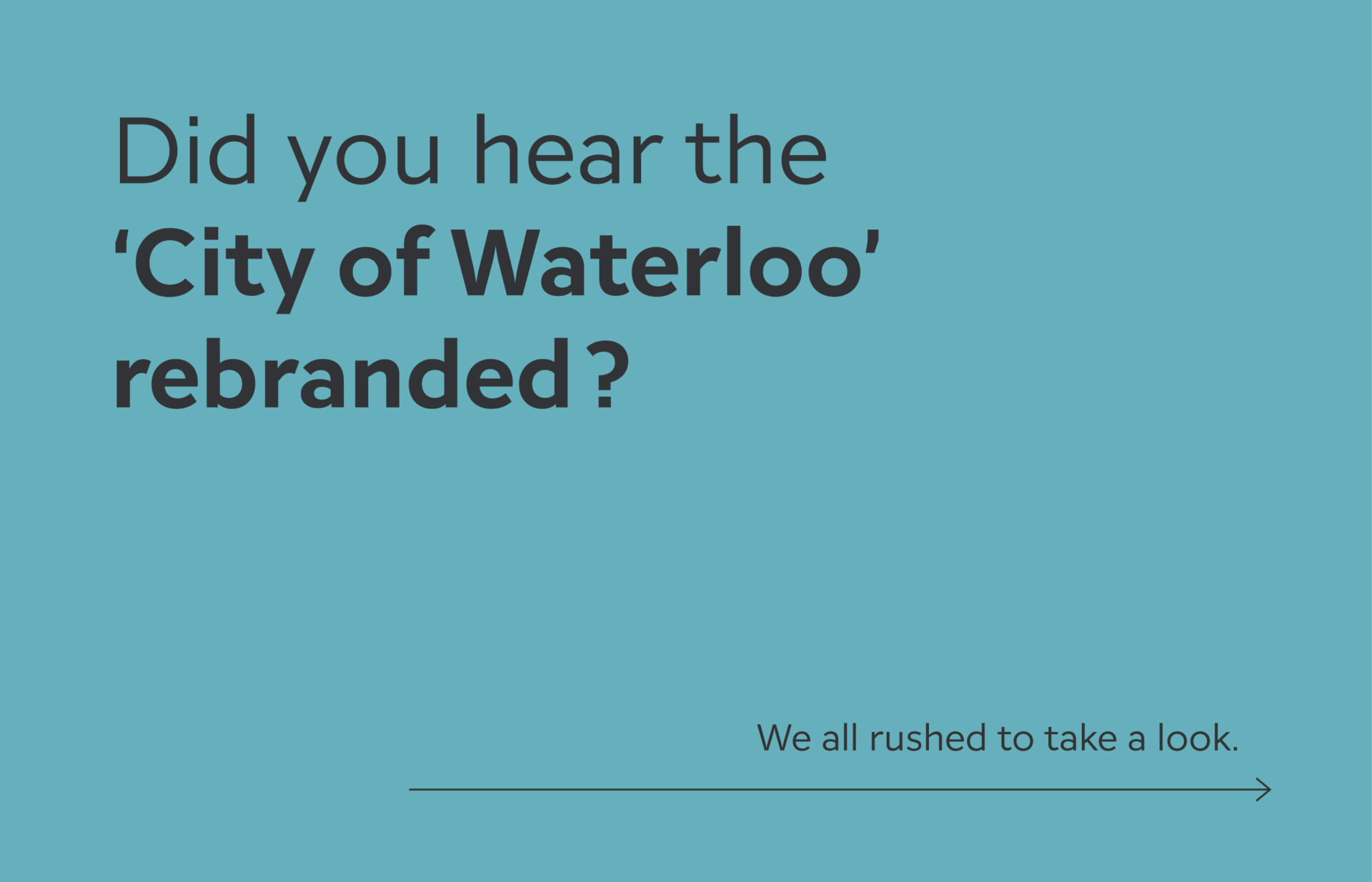
City of Waterloo Rebrand
Did you hear the ‘City of Waterloo’ rebranded?
We all rushed to take a look.
To our surprise, the new brand wasn’t for Waterloo, Ontario but instead Waterloo, Iowa. Oh. False alarm.
Like many people, we’re excited to examine a logo refresh to see the new face of a brand and weigh in on it. As designers, we look to understand how it reflects the brand’s values and resonates with the target audience.
When it’s a brand we have a personal connection with, we can sometimes be more critical of it.
You might remember the negative attention the University of Waterloo “lasers” rebrand had a few years back. It seemed like everyone had something to say. The feedback was so negative that the design was pulled and returned to a fairly safe refinement of the traditional coat of arms that UW is known for. When it comes to brands, it seems that everyone has an opinion.
But this article isn’t about what we think about the new brand for Waterloo, Iowa. Upon discovering this “other” Waterloo, we thought that it’s rare that we have the opportunity to look at how multiple organizations (in this case cities), with the exact same name, brand themselves differently.
Do they look exactly the same? Does each brand evoke a different feeling that represents the aspects of the place and people they represent? How do cities choose to represent themselves? Is it history, geography, reputation?
Turns out there’s a Waterloo in Illinois and of course the one in Belgium that all have unique brands. So we thought it would be interesting to look at all four together.
Why Do Cities Have Visual Brands?
Before we take a look at the brands and how they compare we think it’s important to consider why cities have brands.
#1 with a bullet is of course to send you official looking letters, like property taxes, that you feel compelled to pay. But all joking aside, there are a few reasons.
- To represent the people and communities that live there
- To attract tourism and business
- To attract people to move to the area
- To build a reputation and be known for something
- To look official, build trust, and respect
- To identify municipal services
Although branding includes much more, we explored the visual brand identities of the 4 Waterloos. What does each city’s visual branding look like?
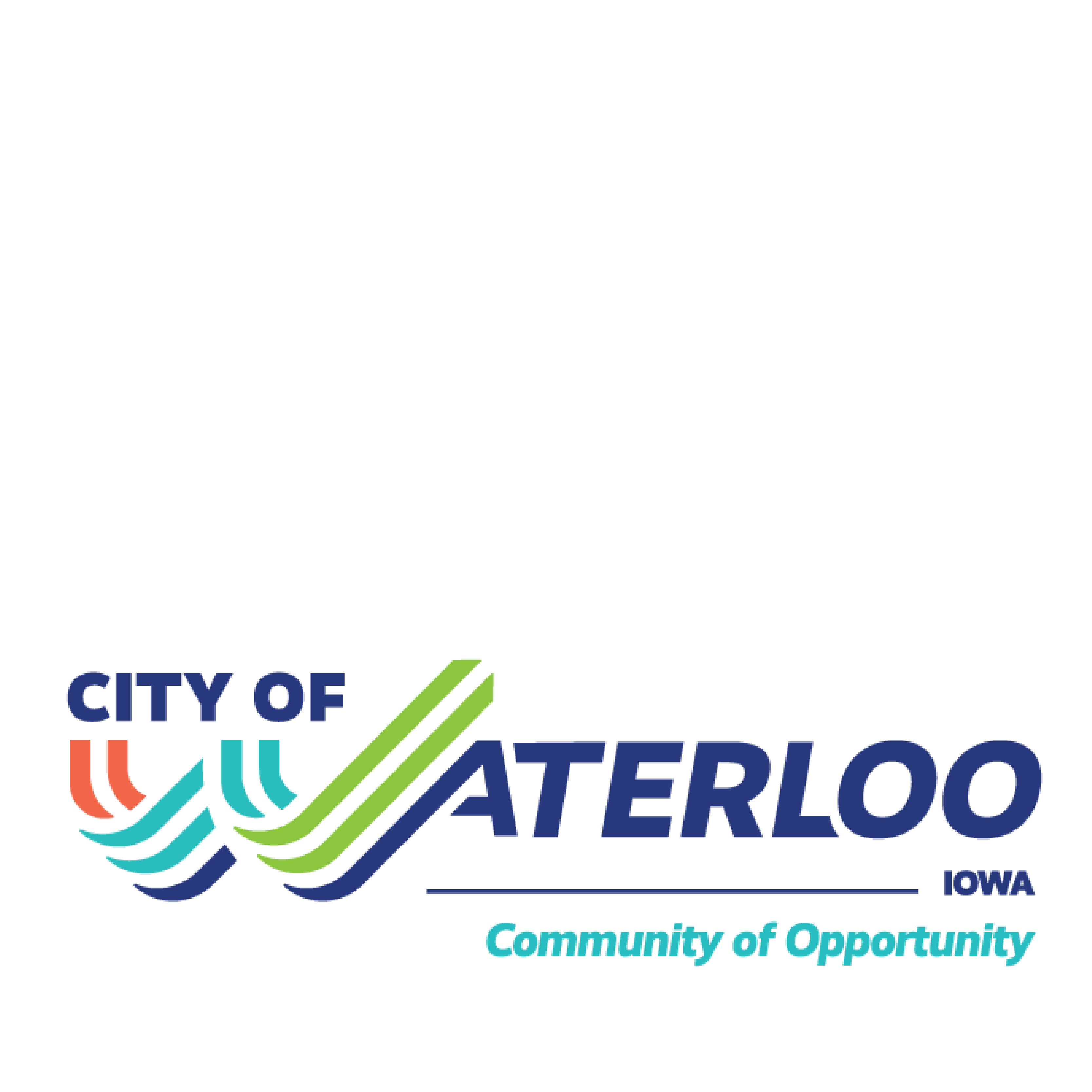
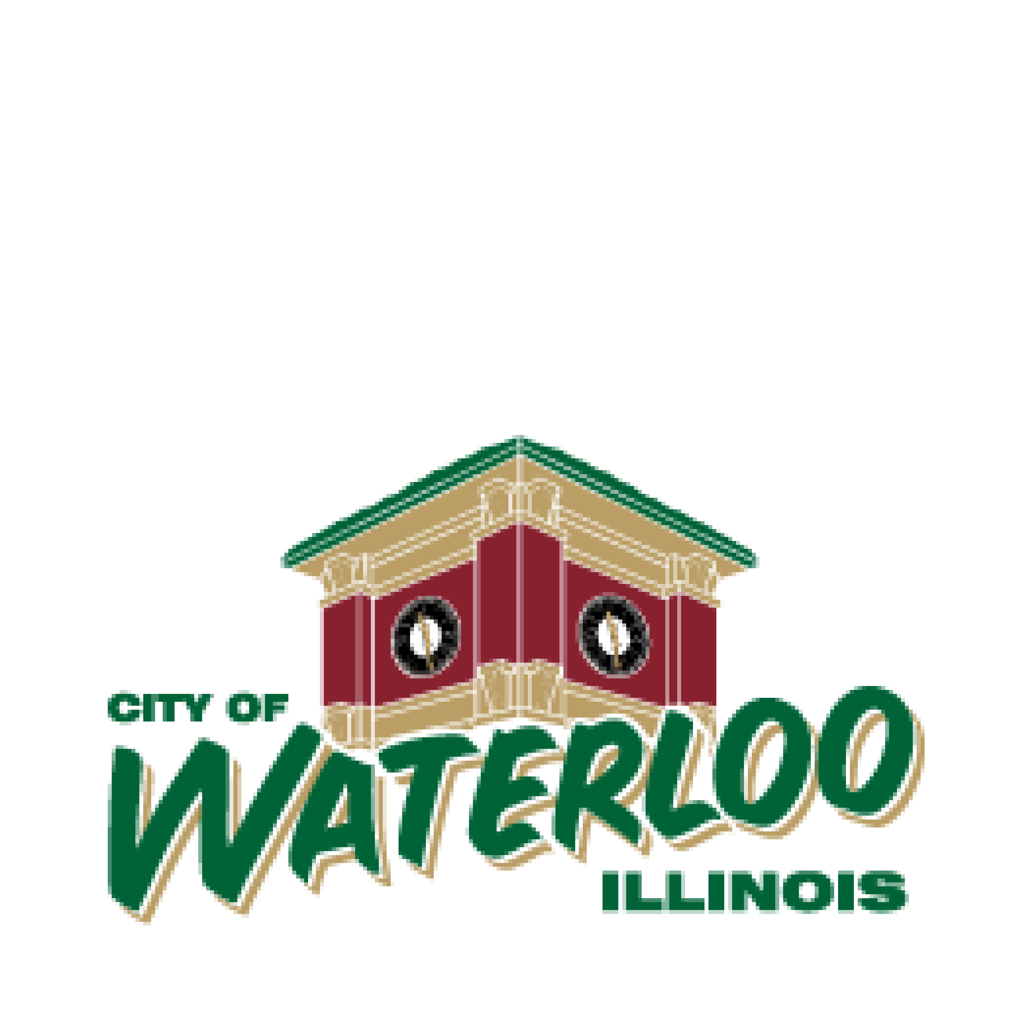
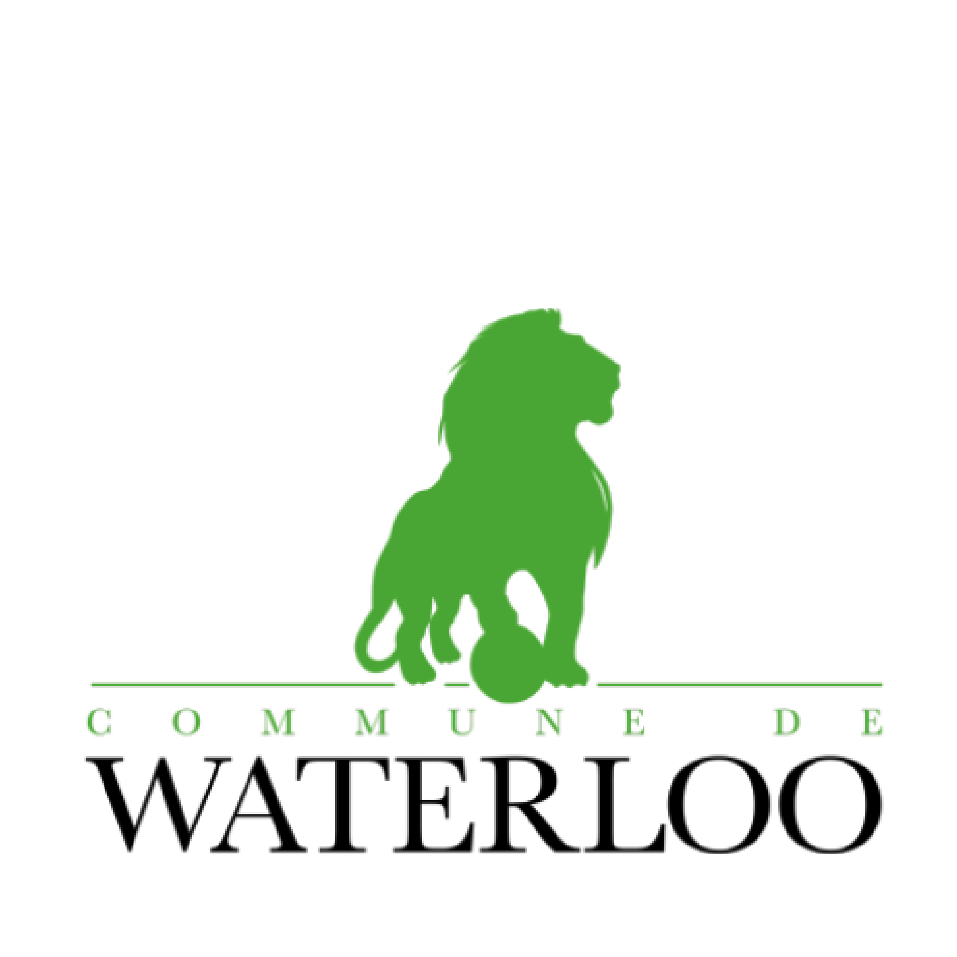
And what does that say to us?
- Energy
- Fresh
- Bright
- Welcoming
- Historic
- Tradition
- Powerful
- Proud
- Modern
- Technical
- Corporate
- Bold
Having seen all four cities’ brands, what do you think? Which would you most like to move to, visit, or work in? Does the way each city is presented inform how you think and feel about these places?
We’d love to have you weigh in. Share your thoughts with us.
Or if you are looking to rebrand your city, our door is always open. Please reach out and we can chat.
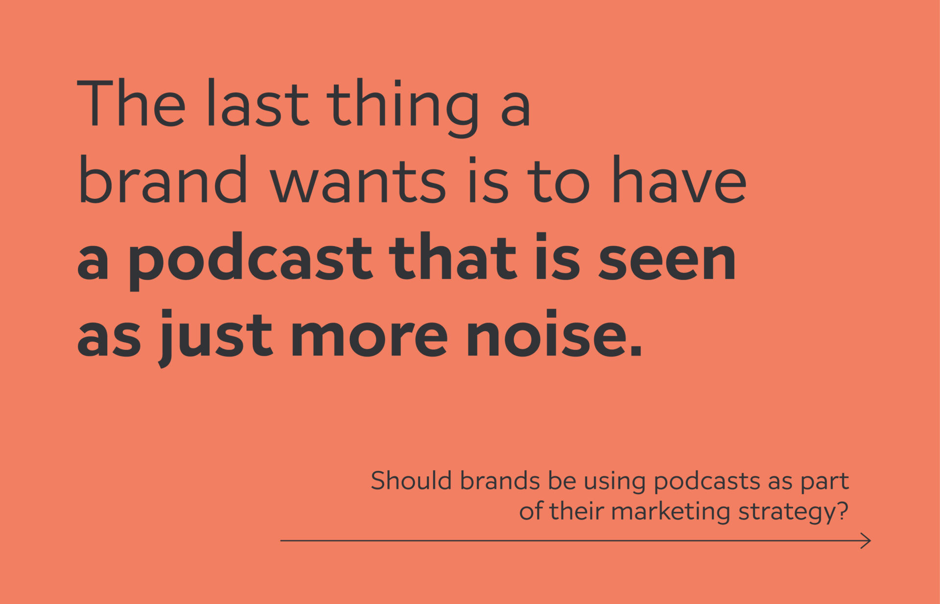
Podcasts – Seems everyone is doing it, should brands?
Podcasts seem to be all the rage these days. There is no limit to what you can find a podcast on. So it’s only natural that brands would be looking to join in on the fun, but should brands be using podcasts as part of their marketing strategy?
I’m sure we all have our favourite podcasts that we queue up for when we’re on the road, exercising, making dinner, or enjoying some downtime. The choices are pretty endless and we can find one on just about anything that interests us. And because we’re picking the specific podcast or topic, chances are we are actively listening through most of it.
With so many actively engaged ears to tap into, brands and organizations are beginning to enter the ring and start a podcast of their own. Positioned as the actual brand, or shows hosted by various c-suite individuals, brands are using podcasts to:
- Give a glimpse into their values or culture;
- Position themselves as an expert in the industry;
- Or demonstrate the value of their product or service
But here’s the thing – with so many podcasts out there, most topics have gotten past the saturation point. There are hundreds of podcasts that are all pretty much saying the same thing, acting as endless echo chambers. Worse still, with nothing different to say, they become time wasters. Listeners skip ahead, or flip between episodes to find the bits worth listening to.
The last thing a brand wants is to have a podcast that is seen as just more noise.

Creating a value-add podcast
When considering if your organization or leadership team should join the podcast making wave, here are a few things to think about before hitting record:
What are we saying that hasn’t already been put out there?
If what you are sharing is a mainstream idea or trend, what else can you add to the conversations?
What unique perspective can we share?
What is it about your experience that not many others can speak to?
How do we keep each episode focused and meaningful the whole way through?
Reading a script can seem unnatural, but rambling about what you had for breakfast isn’t a good use of your listeners’ time either. Have speaking points or direct questions set and ready to go.
How do we make sure that the podcast’s content is geared towards our brand’s equity in a natural conversation?
Do you have clear marketing goals – build brand awareness, support brand values, lift sales, generate lead, build relationship building, or present case studies of your brand to potential customers
Plan, Plan, Plan!
Like any other media channel, a good content plan is key and you want to have a solid content schedule in place before you launch your first episode. Depending on the frequency of your podcasts, a good rule of thumb is to have at least six to twelve months worth of episodes outlined before you get started. And putting together an outline will help you assess if you have enough to talk about and determine if a podcast makes sense.
If you find you don’t have a ton of topics, don’t be afraid to switch gears and create a limited series. Ten really well produced episodes is going to be way more impactful than 24 fly by the seat of your pants sessions!
Another idea to think about if you don’t have enough to support a podcast is to use that content and create short videos that you can post on social media or your website. You can still communicate to your audience the core ideas you wish to share in a super clear and concise approach.
Or consider being a guest on another podcast that aligns with your values, perspective or industry. (You might want to consider disclosing if you paid to be a guest as that makes it essentially a paid promotional podcast.)
Rolling Stone magazine also recently came out with some other tips for companies considering to start a podcast. They are all really great to consider as well as you ponder a podcast.
Hope you find this helpful if you’ve been considering a branded podcast. Feel free to reach out if you are looking for a second opinion on whether it makes sense for your organization or not.
Making the most of your marketing channels
We know how hard it is to come up with meaningful and engaging marketing communications. Whether it’s email campaigns, newsletters, social media posts, digital ads or video commercials, you really only have a couple of chances at most to grab a potential client’s attention. After that, our short attention span brains move on to the next shiney item in our feeds or screens and we forget all about what we saw a minute ago.
So how do you make the most of each opportunity that you get in front of your target audience? How do you stand out from all of the other visual chatter and spectacle to make someone stop and take notice?
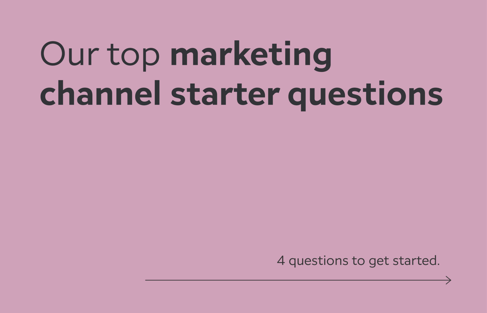
To help you assess how effective your marketing communications are, we’ve listed our favourite questions that we ask at the start of each marketing engagement. All of these will help you look at your different marketing channels to see if there are other opportunities to help you get you to the next level in your marketing.
Our top marketing channel starter questions
1. What are your marketing priorities and goals?
This is always our first question and can be harder to answer than you might think. Have you clearly defined what you are looking to achieve with your marketing? Are you using SMART goals? (Specific, Measurable, Attainable, Relevant, Time-bound)
Clearly stating your marketing objectives helps keep all of your activities focused on these goals and hopefully prevents you from getting sidetracked.
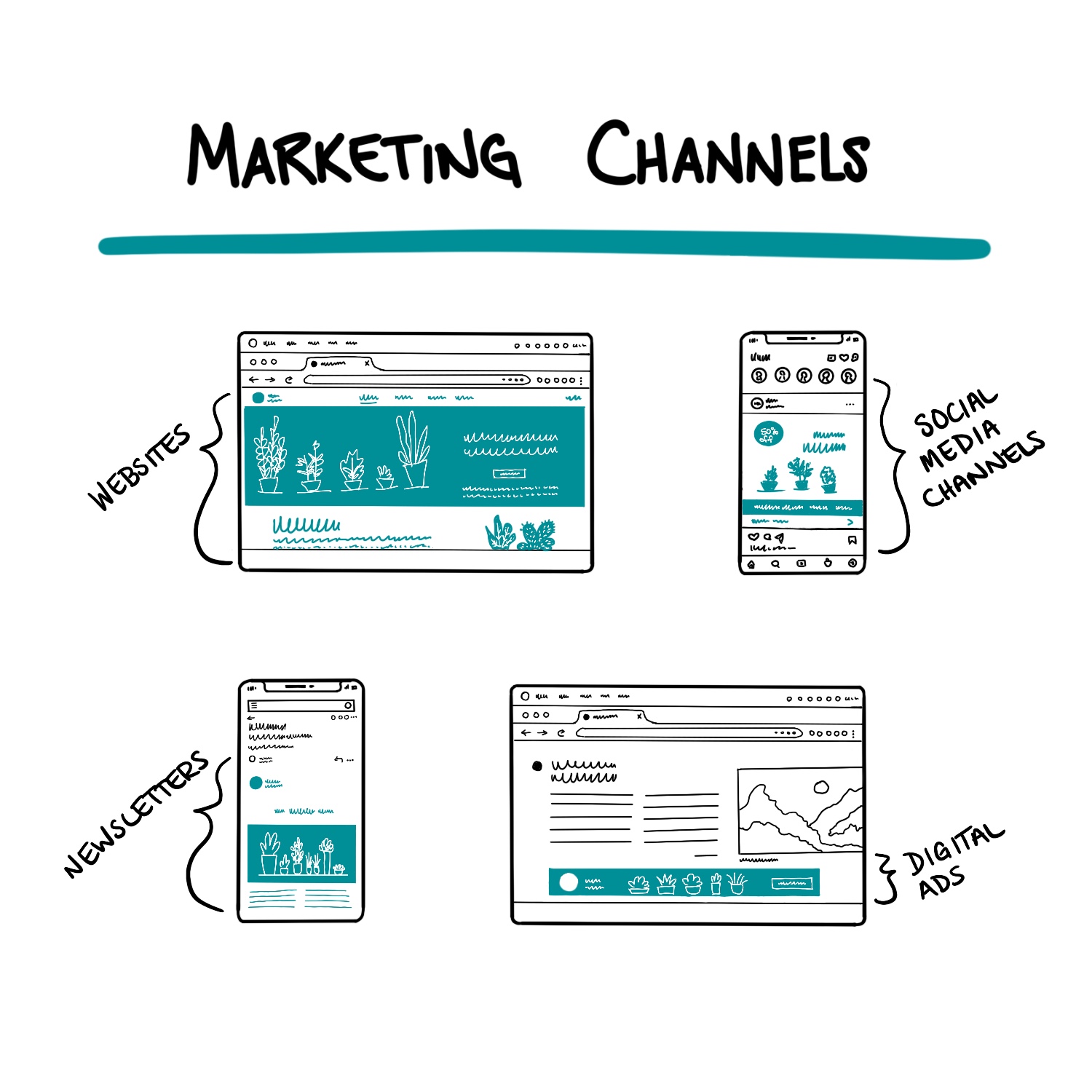
2. What marketing channels are you using and who are your audiences on each?
Sometimes the biggest opportunity can be identified as you better understand who is engaging with your communications and where.
- Website – What information are you sharing on your website and who is interested in that info? Are you getting the desired sales leads, employment applications, or partnership offers?
- Social media channels – What is your follower profile(s)? Are they customers, employees, potential talent, prospects, partners? How do you customize the messaging for different audiences?
- Newsletters – Similar to social, what is your subscriber profile(s)? Who is engaging the most? Where are new subscribers coming from?
- Digital ads – Where are you placing your ads? Which ones are driving the most traffic to your website or leading to conversions?
3. Do you have a key message?
For each of the target audiences, what is the core message that you want to reiterate? How is it relevant to them? Remember that people can only handle a maximum of two ideas in any one communication. Ideally, there is just one – again, our brains are tapped out and for many, if one thought goes in, another goes out, so make sure it is worth it!
4. How often are you reaching out?
There is a balance you want to achieve between too little, too often, and just right. You can find that balance by mixing up the channels, the presentation of the key message, and then scheduling each for the optimal time.
Remember that time is valuable and you don’t want to be seen as wasting it with communications that seem overly repetitive or irrelevant. On the other hand, not often enough and you’re not going to be top of mind.
Feel you need more?
These are just a few of the key questions we ask when beginning a marketing conversation with clients. Every one gives us insights into how we can help improve on your marketing activities and work towards your goals. If in answering these questions, you’ve now got more – reach out! We can work through it all together and build a solid plan to tighten up your marketing and help work towards your business objectives.
Simply Perfect
The Challenge:
Simply Perfect is an off-shoot brand of Custom Foam Systems, a local Kitchener company who has 50 years of foam engineering experience. They came to us to help design and develop a new e-commerce website, visual language and messaging, and a 360 degree, multi-channel marketing plan to help them launch their upgraded Simply Perfect Mattresses. Their goal was to reach new customers within the region to choose a Simply Perfect mattress over other in-market foam mattresses.
What We Delivered:
With an existing name and logo that they were happy with, we began with completing their visual brand and messaging. A solid colour palette and brand narrative rounded out the brand and gave us the foundation to build an e-commerce website.
The website introduced this hidden Waterloo Region gem, showcasing their foam technology and expertise built over the years. With four sizes to choose from, along with custom mattress orders, the website integrates with their in-store ordering process and inventory system.
Following the launch of the website, our team rolled out the media plan. For their launch, advertising channels included radio ads, Google Ads, and targeted display ads to both build brand awareness and bring sales traffic to the website.
The Results:
Launched during the pandemic as a means to fill the gap from lost in-store sales, the Simply Perfect brand is getting out there. As there is never a silver bullet, and with other strategic factors at play, sales have been steady and brand awareness is increasing with more social media followers joining each month since the new website was completed and the marketing campaign began.
The team now has the tools to support growth of this amazing product and we’re excited to see where they end up taking the brand.
Industry
Manufacturing
Discipline
Brand Messaging
Website
Digital Media Campaign
Brand Management
Project Team
Moayad Farah
Erynn Hayden
Truc Hoang
Philip Mondor
Robin Mondor
Contributors
Langen Studios
Farm Fresh Creative
Shahir Premium Halal Foods
The Challenge
Shahir is a Halal food brand deeply rooted in Vancouver, British Columbia looking to expand their reach from a regional player to a national brand. To support this goal, they came to Studio Locale to refresh its brand identity, packaging, and website so as to reflect the integrity of the food itself. It was important for the identity to present Shahir as a premium, established, quality brand, which aligns with the authentic Halal process their products undergo. It was also important that the identity be visually memorable, allow for growth and expansion within the Muslim community across North America.
What we delivered
Identity and Packaging
Within the food industry, packaging isn’t just a vehicle to help transport the products from the store to a consumer’s home. It can be a powerful communication tool used by companies to visually tell their brand story and to differentiate their products from the competition.
Designing food packaging requires a lot of effort and attention to detail. There are different steps and elements involved in the process, from product photography (which requires both a professional food photographer and stylist), to understanding and complying with the specific food label requirements (in Canada this includes bilingual labelling, claims, statements, nutritional info, and ingredients), and finally to rolling out the approved direction across multiple product lines, which may include various shapes and sizes of packaging.
We told the story of Shahir through their packaging; about their commitment to Halal tradition and producing natural and premium quality products. It’s about being able to trust that Shahir products will make every meal, special occasion, and community event a flavourful one. And, it’s about Shahir’s dedication to following all Halal requirements, which ensures the utmost integrity throughout the processing stage.
Website
In this day and age websites are very much a critical part of a company’s marketing strategy. Customers want to be able to go to a familiar place online and find all of the information they may need about the brand, products or services, along with how and where to purchase. More than that, designing and building a brand website as part of brand storytelling is a powerful approach that businesses can use to define and establish brand love and loyalty.
We built Shahir’s website with its brand story at the heart of it. Shahir’s story is about a commitment to Halal tradition and premium quality, naturally. Every page on the new website delivers the message that Shahir has an unwavering commitment to providing quality Halal food choices with integrity. When consumers choose Shahir they never have to compromise on taste or tradition. They can trust Shahir products to make every meal, special occasion, and community event a flavourful one.
The Results
With a successful brand relaunch, Shahir products can be found on the shelves of select Halal grocery stores and national grocery chains.
Industry
Food & Beverage
Discipline
Marketing strategy
Packaging
Brand development
Website
Project Team
Moayad Farah
Erynn Hayden
Truc Hoang
Jessica McLachlan
Anson LeClair
Philip Mondor
Contributors
Langen Studios
Why we don’t typically participate in RFPs
We understand that RFPs have their place and purpose.
However, when it comes to branding or marketing RFPs, they can be really challenging for our industry.
A good design and marketing agency knows that there is not a one size fits all approach in developing a brand, appealing to a target market, creating a website, or solving a communications challenge – these all require unique, strategic solutions. And the struggle with branding and marketing RFPs is that we are not able to have conversations with you.
Sure there is typically an ‘allowance’ period to ask questions after it’s been sent out but those questions don’t even begin to scratch the surface of what we need to know about your company, your goals, your history, and all the nitty-gritty details we like to uncover that come out during our initial discussions.
We believe in open communication
Studio Locale works to reinforce the project understanding by working together through conversation and discovery meetings before providing potential approaches. Our process is designed for the best outcome based on your wants and needs balanced with your goals and budget. Understanding all of this is critical before we can start, and while most RFPs highlight many of the requirements there are often nuances to what is being asked for that need a discussion to sort out. Without that conversation, teams will make assumptions as to what you are looking for which can lead to added scope or incomplete deliverables in the end. And no one likes it when that happens.
We are transformative
We work with organizations, groups, and other businesses who are looking for change and want to do things differently to get to the next level. That level of success requires working with a team who is invested and committed to seeing you succeed – digging beyond surface-level solutions that are only thinking short-term.
If this approach sounds appealing to you, we would be more than happy to start a conversation about what you are looking for and how we might work together on your project.