

Creative transit advertising
Robin and Phil talk with Mike Farwell about creative advertising
Think beyond moving billboard ads on transit. How to use creativity when designing transit advertising to bring a better experience to the community. Studio Locale’s segment starts at 42:53.
Why it’s important to maintain your marketing during a recession
Maintaining your marketing during a recession
A lot of headlines are talking about it – “Are we in a recession?”, “How hard will the recession be?”, “Will Canada go into a recession?” While different outlets and economists are discussing if we will/are, businesses are evaluating strategies and tactics to work through one. And as they consider all the options, here’s why it’s important to maintain your marketing during a recession.
When the economy takes a downturn, buyers tighten their budgets, reduce their spending, and re-evaluate their priorities. Business can see sales begin to drop, and often the first go-to solution is to cut costs to protect profit. One of the line items first to be reviewed and cut? Often marketing.
Why is marketing often cut during an economic slow down?
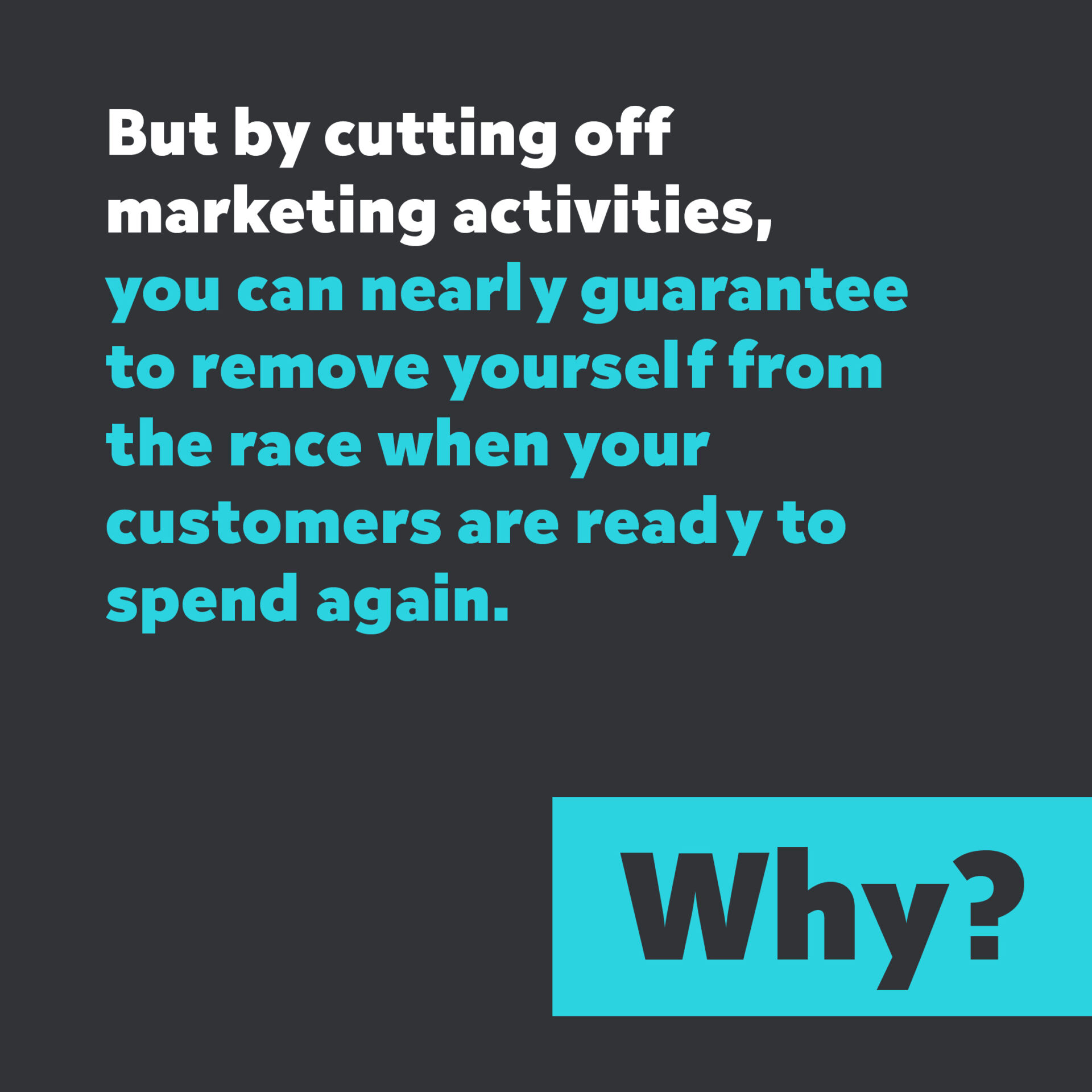
Under the profit and loss statement, marketing is considered an expense. Reducing spend on advertising may seem like a no-brainer way to positively impact profit. However, nothing lasts forever, not even a recession. And by cutting off marketing activities, you can nearly guarantee to remove yourself from the race when your customers are ready to spend again.
Why should you maintain your marketing?
Because, with marketing budgets being cut, buyers are exposed to less advertising. Companies that continue to advertise will have fewer competing messages to contend with and often see it reflected in their recession sales – staying the same or sometimes even increasing! What’s even better is that you can increase sales without increasing your marketing budget – something that you’d have to do in non-recessionary times.
One of the first, and the most often referenced still, studies that measured marketing effectiveness during a recession was completed by Roland Vaile, a Harvard graduate who tracked the performance of 250 U.S. companies from the end of World War I into the 1920s. He found that there was a positive correlation between marketing budgets and sales. Companies that increased their marketing budgets during the economic downturn increased sales by 20% over pre-recession levels. On the contrary, those who decreased their marketing spend suffered a sales drop 7% below pre-recession levels. (You can read more about this study in a number of marketing forums and magazines. A more recent article that referenced this study can be found here.)
So even during tough times when revenue may be declining, there’s still value in continuing with your marketing activities.
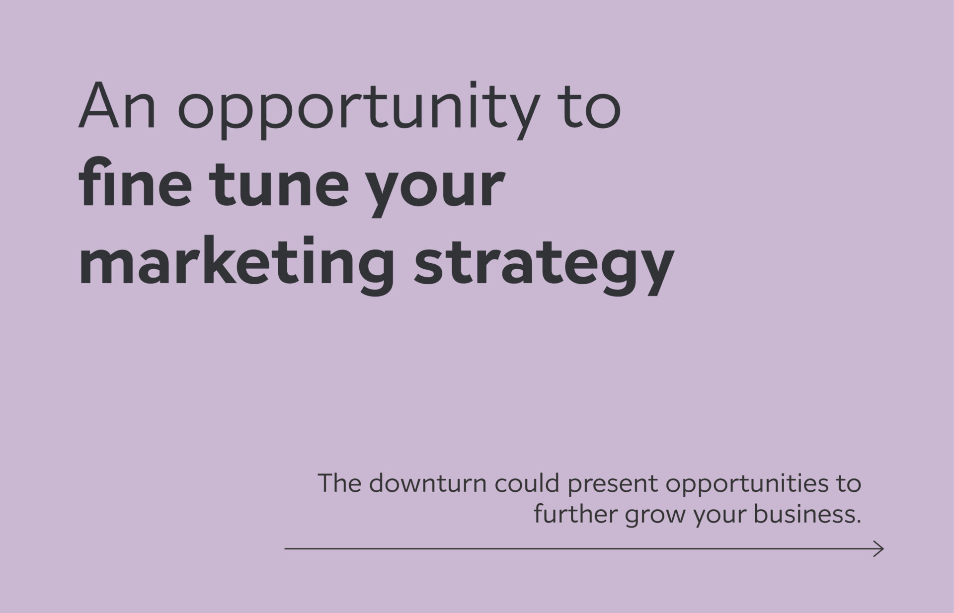
An opportunity to fine tune your marketing strategy
It can also be a good time to evaluate and consider the changes that may benefit the business in the long term. It could be time to analyze your customer base, look for new consumer insights, or explore more effective communication strategies.
The downturn could present opportunities to further grow your business. How can you innovate your products/ services to be more customer-focused? Is there an opportunity to grow the business in a new way?
When there is a downturn in the economy, it can present a number of opportunities to grow your business further – by building brand awareness, reviewing your communications and marketing strategies, or product refinements. We can help use your marketing budget smartly. With services that span across branding to websites to marketing, our team can help you navigate through these scenarios and strengthen your business. If you feel now is the right time, let’s connect.
Rebranding to remain relevant
We frequently can be heard saying to our clients “When you get bored of your branding, your clients are just beginning to become familiar with it.” We don’t take branding lightly. Brand equity can take time to build and changing your brand without any real purpose can diminish your overall brand value. So when we’re approached to partner for a rebrand, we begin in understanding why a rebrand has been put on the table in the first place.
Rebranding for relevancy
Many times at the top of the list is to remain relevant with your client base and target audience. Your brand is no longer resonating with your target market or appearing to align with their values. Or it’s feeling old and stuffy compared to newer brands that are in the market.
But rebranding to remain relevant shouldn’t be like dressing in the trendiest outfit you can find, heading out to the newest club, and then posting crazy antics all over social. When we do that, it’s not too long before we regret the whole thing and go back to the old version of ourselves. Or worse, our new found clients realize we are posing as something we’re not. At the end of the day, we realize that we can’t pull off something that’s different from who we really are.
Rebranding to remain relevant still means remaining authentic and true to your brand attributes and values. Changing to trendy styles, colours, or messaging, when it’s not who you really are, will feel off when clients begin to interact with your company.
Where to begin
When beginning a rebrand to remain relevant, we start with reviewing:
- Your historical journey up to this point
- How your core values have changed from when you began
- The core values of your target audience
- How the industry has evolved over time
This serves as the foundation for developing a new brand that feels more relevant and better resonates with your target audience.
The story behind why rebranding for relevancy is always slightly different. One of our favourite team projects where we rebranded a client to remain relevant is Giffen Lawyers. In all cases, we really dig in to understand the core values and what clients were looking for.
Another example we love is the King Arthur Baking rebrand. As a 200+ year old company, they returned to their roots as a baking company to remain relevant to and resonate with their clients.
Building customer insights into your brand strategy
Customer insights for your brand strategy
It can be tricky to know when to build customer insights into your brand strategy. As business owners, CEOs, or CMOs, we like to think that we have a fairly good handle on our overall brand and marketing strategies. We invest time and resources into determining our name, the product offering, crafting a logo and developing clear messaging. It’s built through product research, market insights, and alignment with our brand vision and values. We identify our target audience through the holes in the landscape, then work to position our solution to fill them.
Yet even with all that work, we still need to keep an open mind and be ready to pivot if our customers present a different opportunity. We may have an idea of how we want our customers to use our products or interact with our brand, but they may find a new way on their own. Successful brands listen to what their customers are saying and adjust their products and marketing when it makes sense. Their brand strategy stays fluid enough to flex with customer insights, while remaining true to their brand values.
One of our favourite examples of this is Vans. The company shifted elements in its brand and marketing strategies a number of times to align with its customers. Most of the changes occurred during its earlier years, while it was still a scrappy start-up. (Not that that was even a term in the late 60s and early 70s?) Some of the most noticeable shifts to incorporate customer insights, in no particular order, have been:
Name change – The now famous shoe company started out as Van Doren Rubber Company. It was named after one of its founders, Paul Van Doren. They changed their name to simply Vans after customers started saying, ‘let’s head down to Van’s”.
Product offering – Their original product was a deck shoe with rubber souls marketed for the whole family. They began to notice that the shoes were becoming popular within the California skate scene as the sole was sticky on the boards. New target audience? Yep! Vans began to focus on creating a shoe specifically for skaters. They even had two skaters help with updating the design of the shoe. By the mid 70s, almost all of the skaters in the area were wearing Vans.
Tagline – Their tagline “Off the wall” is from a skateboarding term coined in the 70s while Californian skateboarders were literally doing tricks off the walls of empty swimming pools. Early skateboarders were pioneers in the sport and embraced individuality. The term is often associated with being rebellious and creative. Vans adopted it to reflect the spirit of the brand and the ethos of its customers.
Successful brands listen to what their customers are saying
Customization – Allowing for more creativity for its customers, Vans offered custom orders where you could choose different colours for the 3 main areas of the shoe (toe, heel and sides). This let each rider have their shoes reflect their own personal style and included making unique left and right shoes. We love that Vans still has customizable shoes. Not only can you choose your colours, but you can also upload your own art and customize the checkerboard! (There was a time where you could also buy just one shoe – the left or the right – as your kick foot would wear faster. Vans was providing a solution that was unique to their main customer’s problem, which broke the convention of always selling 2 shoes – off the wall again!)
Going with the flow and listening to their customer base however didn’t secure the success of Vans. They have had their share of challenges, including filing for bankruptcy protection in the 80s after introducing too many style variations. They were able to come back from it and have continued expanding the brand to appeal to a larger target audience. Their brand and marketing strategies, while fluid enough to shift to these changing target audiences, have stayed true to their brand values. Something that we believe has largely contributed to their success.
Rebranding a family business
It’s a family affair
It’s not uncommon for family businesses to plan its succession around future generations taking over. It’s a practice many have planned from the get go. (Or when their kids show an interest in the business!) Often they are named after the founding family members, the family name, or even something enduring to the family as a whole. The initial logo may have been an image of the homestead, or of a family element.
However, as the family business evolves there may come a time where rebranding makes sense. The rebrand could include an updated logo, a new name, or new brand messaging.
A few of the common scenarios include when:
The family business is becoming a family-owned brand
We all love a great success story. A small, family-run business with humble beginnings takes off and is working to become a popular, sought-after brand. A name change may not make sense if brand equity is already there. However, an updated visual brand can be helpful as it is introduced to more potential clients and positions itself against larger competitors.
The geographic target area grows
Many smaller family businesses begin in their local area. When the decision is made to expand beyond the immediate areas, it’s a good time to take a look at how the brand will be received by the larger target audience. What resonates with your local market may no longer work as your sales area increases.
You’re ready for outside investors
In this scenario, you may have a brand review as part of your business plan after outside investors have committed. Being open to reviewing your brand and making changes to appeal to a larger audience, shows outside investors that you’re serious about growth. But note, this is a review of the brand, not necessarily your values. Compromising quality or commitment to your products and services should not be up for discussion.
There’s a changing of the family guard
Sometimes the rebrand reflects the transition from one generation to the next. It symbolizes the change in leadership and the introduction of fresh ideas, strategies or offerings.
It’s been bought by a non-family member
There are times when the next generation has selected another career path outside of the family business. When a non-family member has purchased a family business, a rebrand may be a good signal that the new owner is just as committed to its success as the family was. There is an investment being made towards the future of the business.
In all cases, the rebrand for a family business should consider:
- If the family name has any meaning to those outside of the current market
- How relatable or relevant the brand visuals are to its target audience
- How well the brand compares to its competitors
- The brand elements that are core to the brand and its values
It's not uncommon for family businesses to plan succession around future generations taking over
Pioneer Craftsmen is a great example of a family business that rebranded to support its growth. In its 3rd generation of family leadership, the brand refresh successfully expresses Pioneer’s forward-thinking design and craftsmanship while still paying homage to its heritage. It continues to represent the lasting quality that the company is known for.
Love to hate or hate to love creative AI?
Being in the creative industry, we’ve been paying attention to the use of AI for creative outputs. Two that have been in many conversations are DALL-E and ChatGPT. DALL-E is an AI system that can generate digital images from users providing natural language text direction, and then images from the internet, to produce a result. ChatGPT has been making waves with its ability to produce written responses to a question, as it pulls from the vast amount of information on the internet along with guidance from human experts. (Both DALL-E and ChatGPT are offered from OpenAI.)

This has us talking. Is there value to AI generated creative content? Can it help us be more creative? Can it be used to ‘level up’ the starting point for creative content? How does it impact the creative process, specifically the initial exploration phase? Is this leading to a ‘design by committee’ level of output? Will it weaken or strengthen our creative abilities? While humans look for ways to do things faster, and more efficiently, we still have a need to experience struggle, which then in turn pushes us forward; Does AI limit that struggle?
So we asked an authority(?) what they thought:
“An important way in which humans are still better at generating new ideas is that humans have emotions … . Emotions help to identify which ideas are good and which are bad. They give the motivation to pursue some ideas and not others.”
~ ChatGPT
Sources: The Guardian | Stanford University
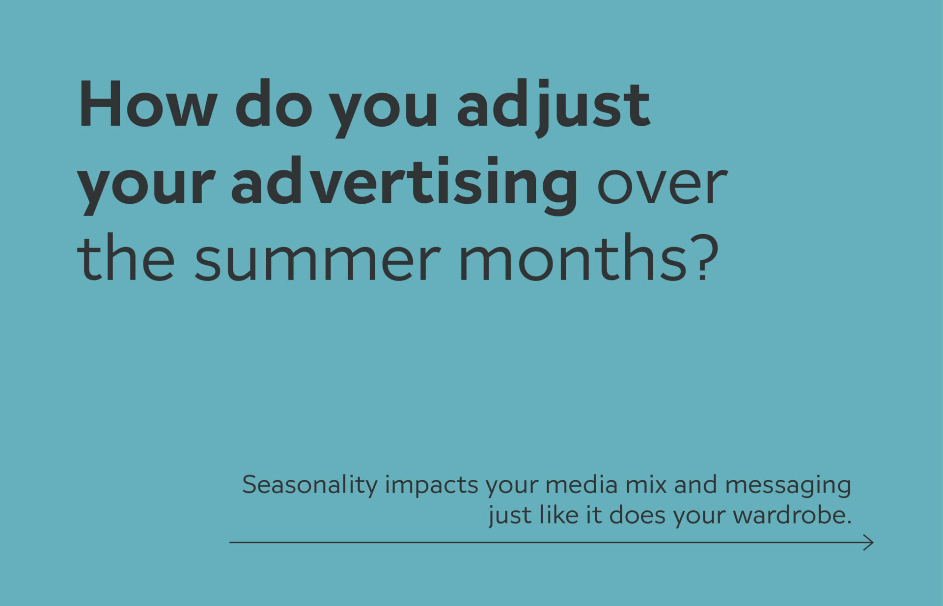
Summertime Marketing Media Mix
With the warmer weather of summertime, people are eager to get out of their homes and enjoy the great outdoors. We are all craving the sun and looking to be outside. That change in lifestyle leads to a different media consumption as people tend to stay away from their TV and spend less time on social media feeds.
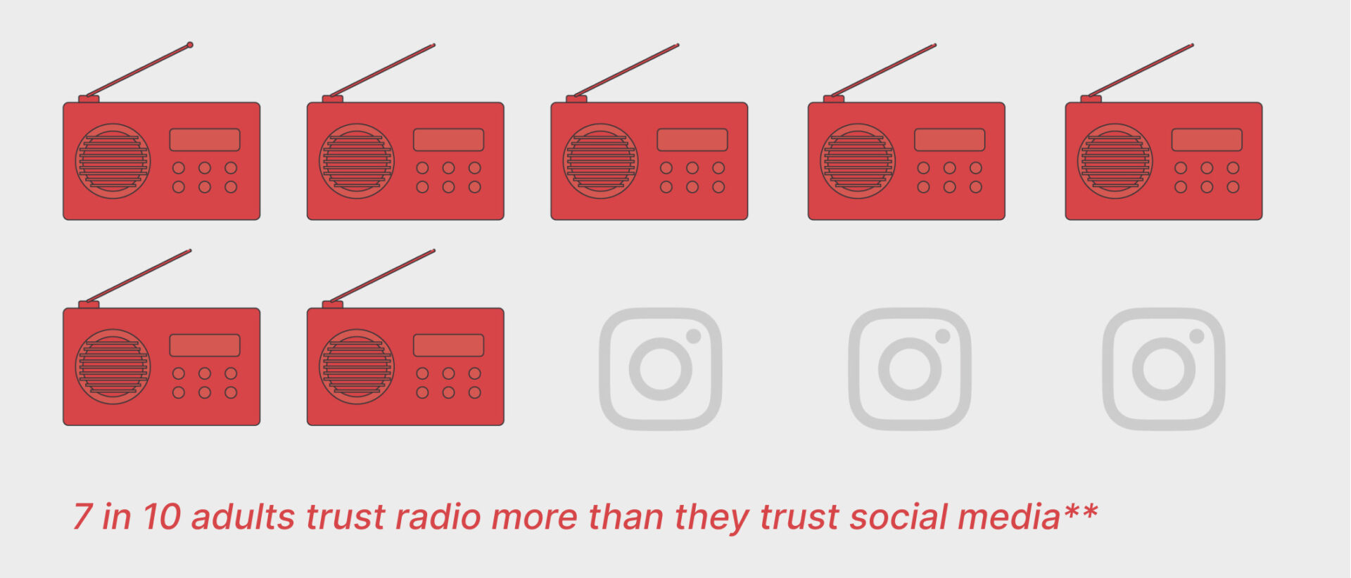
“Audio ads in the summer can help reach your target audience when they’re less likely to be distracted by a cluttered media environment”
So how do you adjust your advertising over the summer months? Consumers typically increase their audio listening as they head out on a road trip, relax at their campsite or on a cottage dock, or are gardening in the backyard. So audio media can be an effective addition to your media mix over the summer months. Your messaging can also reflect the change in season, and be adjusted to work better for passive listening.
Seasonality impacts your media mix and messaging just like it does your wardrobe. Planning for the changing seasons can help improve your media ROI.
Source: **Young Canadians More Trusting of Information on Social Media Than Other Generations
Seasonal Marketing Campaigns
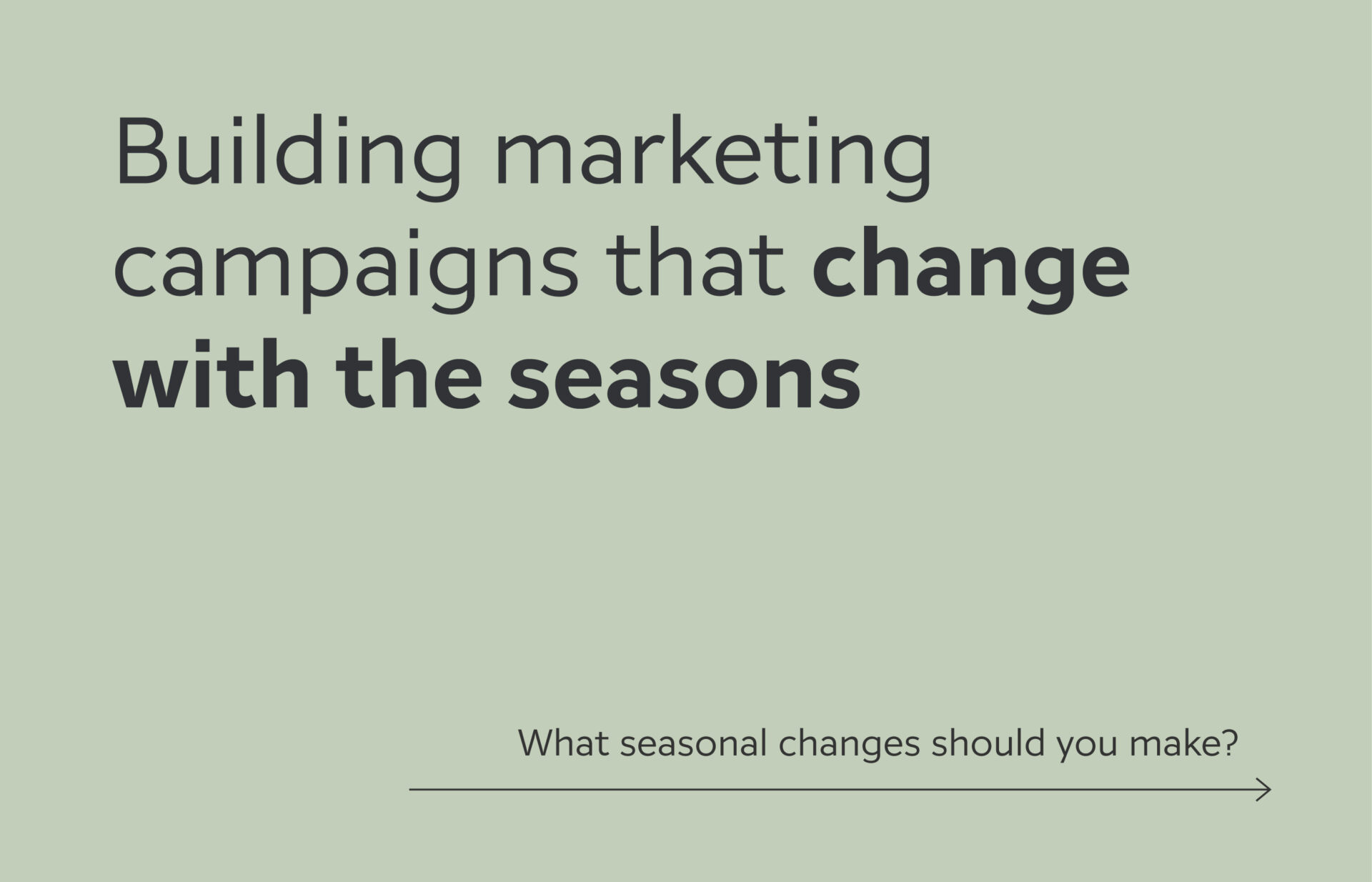
Building marketing campaigns that change with the seasons
Having consistent marketing throughout the year definitely helps in building brand awareness and driving sales. When you build marketing campaigns that change with the seasons, it’s a smart way to leverage naturally occurring events or buying trends over the year. It also can help make the most of your marketing budget and have a positive impact on your ROI.
What seasonal changes to make?
Your strongest season will depend on your individual business. So your individual marketing campaigns should be based on your yearly demand and sales fluctuations. There are so many considerations to look at when you’re building your campaigns. What works for one organization may not work for another, so you need to look at your specific business and build what makes sense for you. As you create your marketing campaigns, here are some of the key elements to look at and how you can change them over the course of the year.
Changes to your messaging
Making updates to your messaging can be a quick way to keep your ads relevant and your audience engaged as the seasons change. It can reflect features/benefits during peak purchase times, build brand awareness and trigger future purchase planning, recognize special events or celebrations – whatever will resonate with your target audience and aligns with your brand.
Changes to your media channels
As you plan the media channels you will use over the year, having an understanding of where your target audience will be can help you determine which ones are best when. You should consider where your target market can discover your product or services, and when they will need it. When are your clients actively searching for your solution vs. when it’s more effective to build brand awareness for future purchases? What marketing channels best support any seasonal goals? Now’s the time to consider all of the channels – digital media, traditional media, video, print, and radio ads. There may be some hidden opportunities to connect with your customers.
Changes to the frequency
Similar to considering which channels make the most sense, how often ads should be presented can also help optimize your marketing ROI. Ramping up before and during a busy sales season and then adjusting to maintain brand awareness on the off season is an efficient use of marketing dollars.
Changes to your visuals
Your visual brand can be one of your strongest assets when it comes to brand recognition. Giving it a seasonal lift or shift can be an effective way to grab your customers attention in the midst of the usual visual stimulation.
Changes to your promotions
Outside of your media elements, you can also look at running special promotions leading up to and during your peak season. In addition to straight price savings, you can also consider cross-promotions with other companies that compliment your products or services. Running ads, email campaigns or dropping flyers are some of the channels to let your customers know of any seasonal offers.
Netflash Internet Solutions
The Backstory:
With minimal in-house marketing resources, Netflash is a Waterloo Region-based Internet company that required outsourcing of a marketing agency. In addition to high-speed Internet, Netflash Internet Solutions also provides various phone and TV packages. Competing against larger ISPs, the team is busy implementing bigger strategic projects in addition to managing the day-to-day activities.
Aware that their brand messaging and marketing needed some TLC and dedicated resources, Netflash contacted Studio Locale to be an extension to their team and manage all of their marketing initiatives.
What We Delivered:
We have worked with Netflash on different projects over the past years. Because of this, we have a fairly strong understanding of their business, products, target audience, competitive landscape, and business challenges. We were able to jump right in and begin with some tactical execution for inflight initiatives and recommend some branding tweaks. (If we don’t have an existing relationship, fret not. We’ll buckle down and learn everything we need to know to be an effective marketing extension of any organization.)
Understanding the need for ongoing communications to support various expansion initiatives, we created a communication schedule, crafted quick messaging and designed templates for immediate distribution. Flyers and emails were distributed, and landing pages were created to support and achieve conversion targets.
With the immediate marketing needs covered, we looked at the current competitive environment. There were some aggressive competitive campaigns and we wanted to better position Netflash against them. As many business owners know, it is challenging to define your unique value proposition (UVP), and Netflash’s UVP and differentiators had become complicated in their messaging. We took the team through an exercise to clarify and simplify their core values and value proposition.
We presented messaging options along with a supporting visual lift for each one. The goal for each creative marketing approach; make Netflash easy to remember, support brand awareness and have a single message that reinforces their differentiators.
Once a direction was selected, we rolled it out across all marketing touchpoints. We updated their flyers, emails, and digital banner ads to reflect the new messaging and support overall brand awareness – Along with specific calls to action based on where and who’s receiving the message.
Keeping open communication between Netflash and the SL marketing team is critical. We have standing monthly meetings to review activities, and results, and determine if any shifts are needed to support the team.
The Results:
The Netflash team is happy to have dedicated marketing resources supporting their internal efforts. Within the first year they have seen:
- A new targeted service area achieve a 41% market share rate, just 4 months after launching their services
- New leads through their website increased 20% over the previous year thanks to a compelling digital ads campaign
- Direct mail and digital ad campaigns in their existing targeted service areas help them become the market leader with a dominant market share in those areas
Industry
Communications
Discipline
Brand messaging, graphic design, media planning, marketing materials
Project Team
Erynn Hayden
Truc Hoang
Jessica McLachlan
Anneta Wamono
Philip Mondor
Robin Mondor
Improving Google Ads Campaign Results
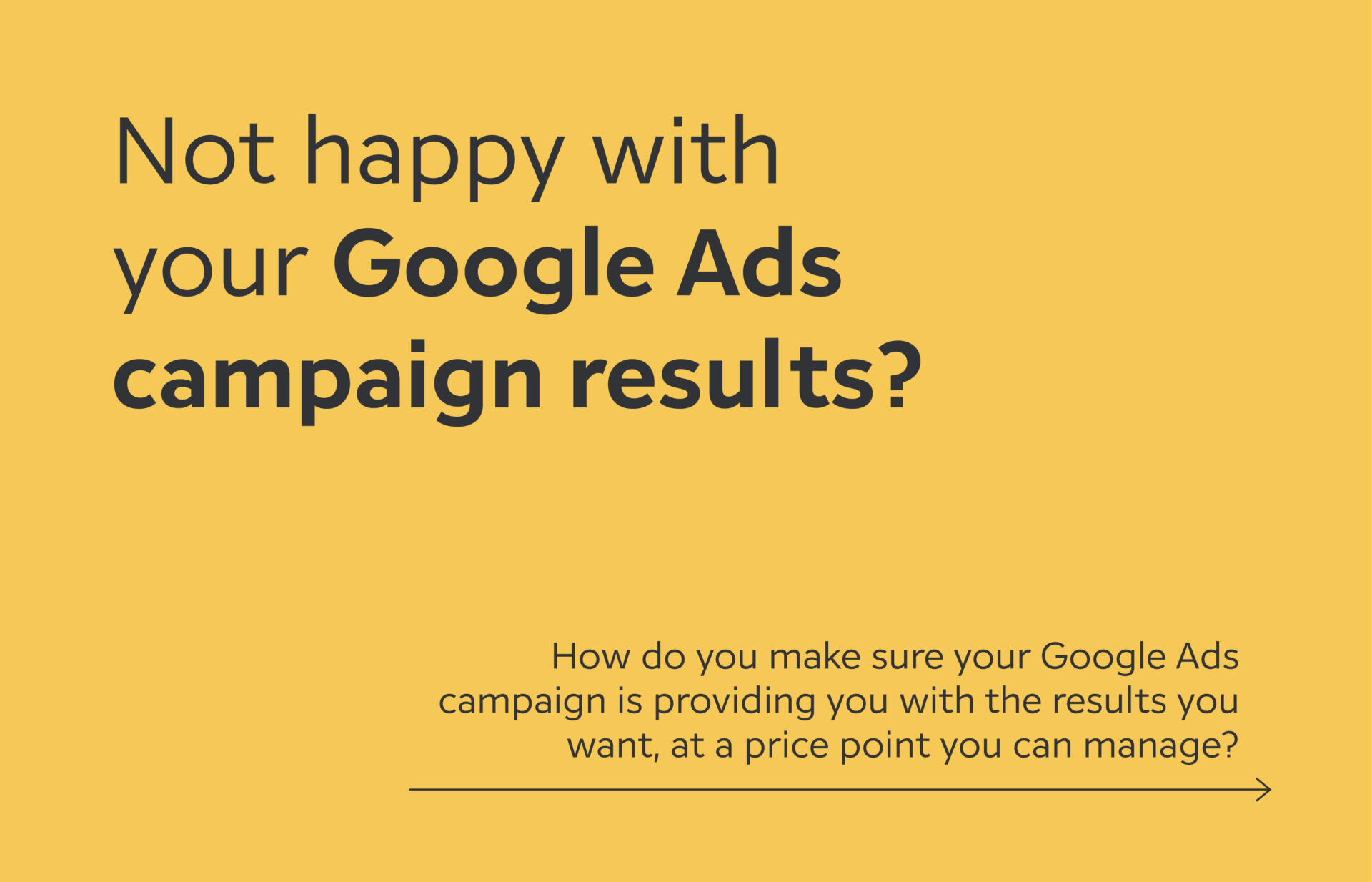
Not happy with your Google Ads campaign results?
The reality of your company appearing at the top for an online search these days is that you need to pay to rank. This makes the ongoing management of your Google Ads campaign a priority on your to-do list. And while you want to rank in one of the top positions, you don’t want to have to throw more money at it than you need to. So, how do you make sure your Google Ads campaign is providing you with the results you want, at a price point you can manage?
Let’s start by looking at the metrics that are usually a good indicator that your Google Ads campaign may not be running effectively.
Your Google Ads are not showing
Your ads are not showing on the search engine results page while you try to search for the relevant keywords
Not seeing the volume of leads you’d like
Your monthly Google Ads report is showing impressions but your click through and conversion rates are low.
Receiving a lot of leads but the quality isn’t there
Your sales team is receiving leads but the contact profile doesn’t align with your target customer.
Your keywords list is huge
In an attempt to hit all of the possible keywords, you’ve included every possible keyword, essentially casting a very large net that’s not catching the leads you want.
How you can improve your results
Keyword review
A close review of your keyword list, as it relates to what your target audience would be searching for, will help your ads present to the right audience at the right time. Just as important as your targeted keywords are those that should be on your negative keywords list. Make sure you include only search terms that align best with your ideal customer.
Updating negative keywords
Negative keywords let you exclude irrelevant search terms from your campaigns and help focus on only the high quality keywords that drive results to your business. Updating negative keywords regularly will save budget on Google Ads, as they will enable you to attract the right leads and avoid searches that have low chance to convert.
Target specific locations
Be specific with the locations you want to show your ads to and select the exact areas that your business is serving. That will help increase conversions and help use your ad budget in an effective way.
Improve the ad quality
Ad quality is evaluated on a number of factors: how relevant your ad text is to search intent, how likely users are to click your ad and the quality of users’ experience once they land on your website. Ads that closely align with the intent of the search query are highly likely to receive more clicks.
Bid strategy
Determining a bid strategy that best serves your business goals is one of the key factors that impacts the effectiveness of your Google Ads campaigns. Whether you want to build brand awareness, lead traffic to your website, increase brand consideration, or encourage customers to take a direct action on your site, the right bidding strategy is crucial.
Website content and user experience
It may be that your ads are presenting at the right moments, but the supporting content on your website isn’t convincing enough for them to get past the first page, fill out your contact form, or call. User experience on the landing page can have a huge impact on your Google ads effectiveness. The better your website content, the less likely users will bounce off the landing page without taking action. With more useful information and a better experience, the better your ad quality score will be, which helps your ad show in a higher position.
Feels like too much?
Our team can help! We’ll manage all of these campaign components and considerations for you. Each month, we’ll provide you with a summary of results and actions taken during the month to optimize the campaign. We also provide recommendations for additional tactics to improve the campaign performance so you are not wasting your money.
Reach out and our Google Ads experts will be happy to talk next steps!

Judging For The 2023 RGD Student Awards
Phil is a judge for the 2023 RGD Student Awards
Anyone who knows Phil knows of his love for great type. He is one of the judges for the 2023 Award for Typography in this year’s RGD Student Awards.
How to select a marketing agency
How to find the right agency for you
The thought of selecting a marketing agency that best fits with your organization may feel overwhelming at first. There are many agencies to choose from – all with different approaches, experiences, and price tags.
Ultimately, you want to find a team that understands what you need, and is easy to work with. Here are a few tips to help make the process a bit easier and hopefully enjoyable.
Start with a conversation
When beginning any relationship, it’s important to make sure you are a good fit for each other before going all in. You will be able to determine how invested an agency is in your success based on the types of questions they ask you. In turn, you can gain insights into their approach to your specific challenge and the experience they will bring to the table.
Be prepared to share
Be ready to provide specific goals and targets, challenges, timelines and budgets. Without this information, it will be difficult for any agency to come back with a viable approach and recommendations. (We equate it to asking an architect to design you a house without sharing elements of what you have in mind. You might be thinking of a classic Georgian and the architect is thinking contemporary; 2 storey vs. bungalow…. You get the picture.) If you don’t have those details yet figured out, be honest about that too. Many agencies can help define and set goals as part of the strategic planning process.
Collaboration is key
You feel a good connection with an agency but aren’t sure their recommended approach is the right one. Don’t hesitate to suggest working together to find an alternate plan. There are multiple paths you can take to get you to where you want to go. A good agency will know that and be open to finding the best course of action that works for your organization.
If you feel your organization is at the stage of needing an outside agency, shoot us a note. We’d be more than happy to sit down and have that initial conversation. Shoot us a note and we’ll get started!