

Professional Sports Team Branding: KW Titans
Professional sports teams contribute a lot to their communities, and their branding can be a source of pride and bragging rights for their fans. Get it right and teams have a network of authentic ambassadors who willingly wear their team’s gear and merch, building brand awareness and hype. Get it wrong, and even with quality play, you might find it challenging to find it anywhere off the field, court, or rink and be facing an uphill battle to gain support.
The Backstory
KW Titans is a professional basketball team in Waterloo Region, offering quality basketball that is a step below NBA level. Players have come from across North American to play for the past 10 seasons, delivering a fast paced, winning game experience.
Traditionally thought of as hockey towns, Kitchener, Waterloo and Cambridge have each been growing in population and diversity, bringing an expanded love to a growing number of sports. There has specifically been growing popularity of basketball within the region with local representation in the NBA/NCAA, but game attendance isn’t growing at the same rate and ownership was struggling to get more people aware of the team and come to games.
What was working, what was not
Reviewing everything Titans, the team is doing everything that you think they should be.
- High quality coaches and players
- Finished in the top 3 past two seasons
- Lively in-game entertainment (announcers, DJ, half-time shows)
- Active on social media sharing game and team updates
- Radio and billboard advertising
- After game player interactions for fans
- Consistent branding across touchpoints
- Out at community events
But there are a few things being done (or not done) that have limited their reach and appeal.
- An overly ‘safe’, family approach that doesn’t provide any opportunities for any edginess in ads, merch or other materials
- A lack of marketing that creates hype and a desire to go and check out a game (and gain fans!)
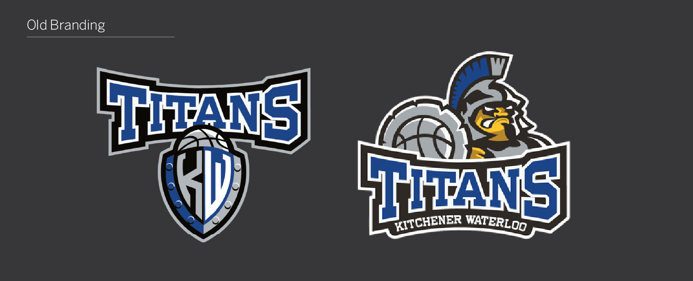
- A varsity look and feel that doesn’t represent the quality of the game being delivered
- Branding assets and colour palette that provide elements that stand out in the continuous scroll
- Limited community engagement off the court, (missing demographic groups)
- Sponsorship partners that reach missing demographic groups
- The website had competing messages with no clear CTA to buy game tickets
- The need for stronger relationships with sports media and tourism
So with this, Studio Locale began working with the Titans to build up brand recognition, appeal to a larger base, and ultimately get more people coming to games.
Rebranding a team needs to be authentic to the sport, the culture, and the fans. Knowing this, we started there – interviewing the players, coaches and talking with fans about the level of ball being delivered, and what was missing when it came to the energy of the branding.
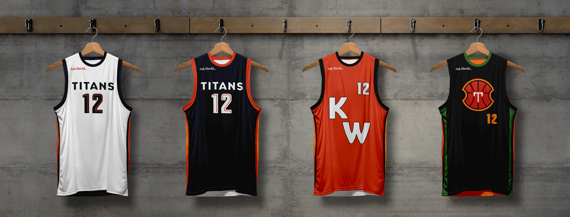
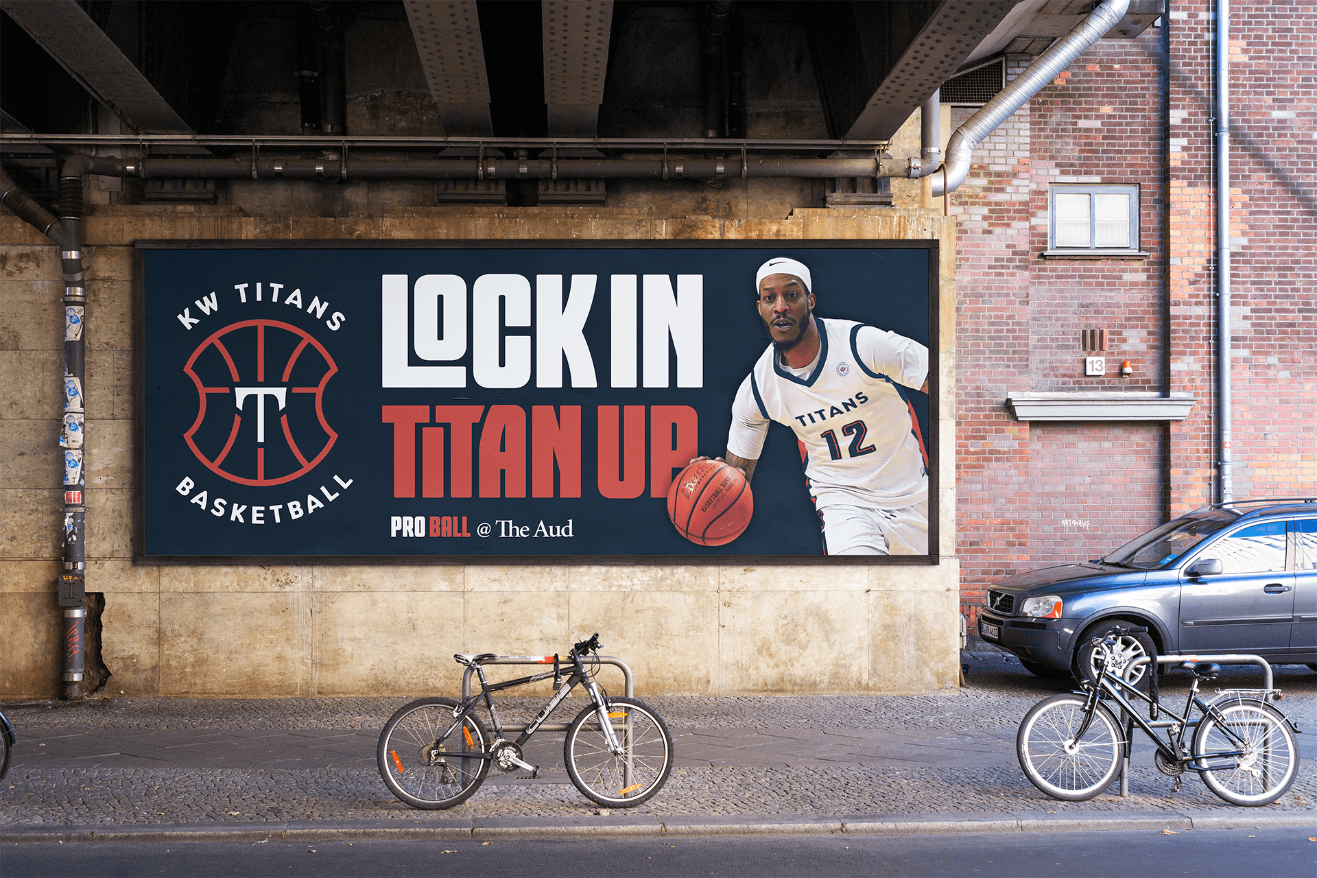
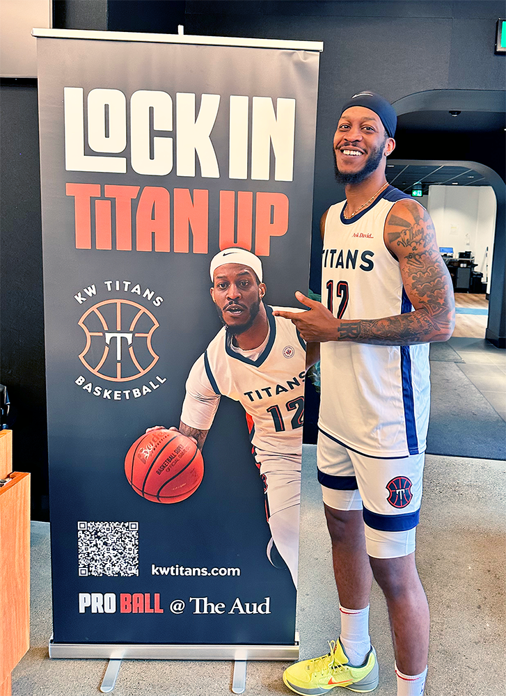
The Rebrand
The new branding created a revived energy for the whole team. Management, coaches, players, and fans all felt a jolt of excitement and anticipation for the new season.
The rebrand reveal was combined with the season launch event and included players, city officials, media and VIP fans. Carefully crafted, it included a launch video along with a Q&A around the rebrand and what people can expect for the upcoming season.
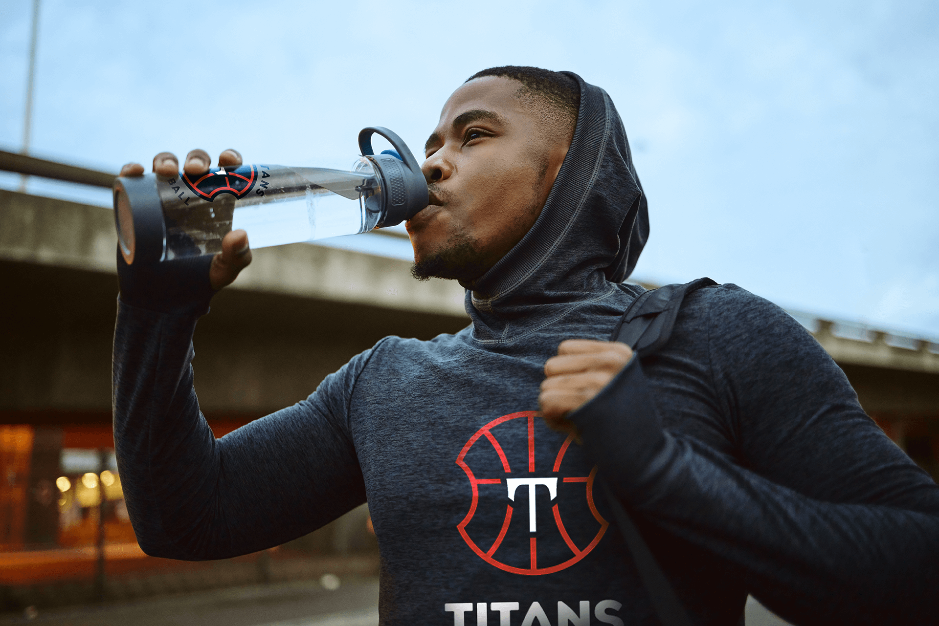
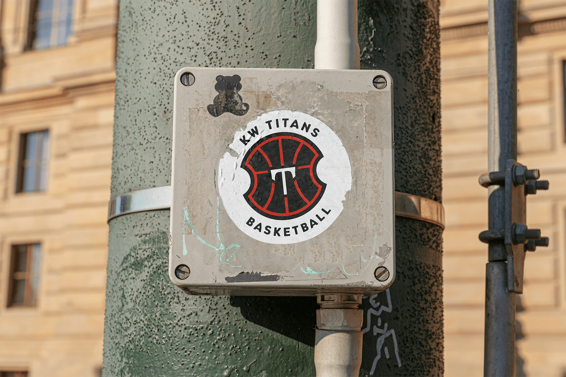
The new branding is appearing all across the region, at The Aud, on billboards, buses, and most importantly on fans! Special merch offers for season ticket holders and existing fans is getting it out on the streets and building hype for others to get out and watch the team’s 9th season of pro ball. Everyone’s getting ready to Lock In, Titan Up!
KW Titans Launch a New Era with Bold Branding by Studio Locale
The KW Titans are stepping into their ninth season with a refreshed look that celebrates both the team and the community. Studio Locale had the pleasure of leading the design and marketing work, creating a clean, modern identity rooted in KW’s pride and energy. The new branding was unveiled at a launch event at Stockyards Brewery, giving fans, players, and the community a first look at the bold new direction.
“There’s a design purity to it — a resonance you see right across basketball,” said Studio Locale partner Philip Mondor, describing the new shield logo that combines basketball geometry with classical Greek mythology.
“It’s been a real leap of faith to branch out from traditional Titans hues, but I’m confident the city will embrace our new look,” says Titans CCO Kate Schooley.
“Every few years, you have to look at how to connect with the public. We thought this was a great opportunity to do this … it was time for a refresh,” adds Titans CEO David Schooley.
Veteran guard Joel Kindred, now calling Waterloo Region home, sums it up: “Good energy, good feel. Everything just matches together.”
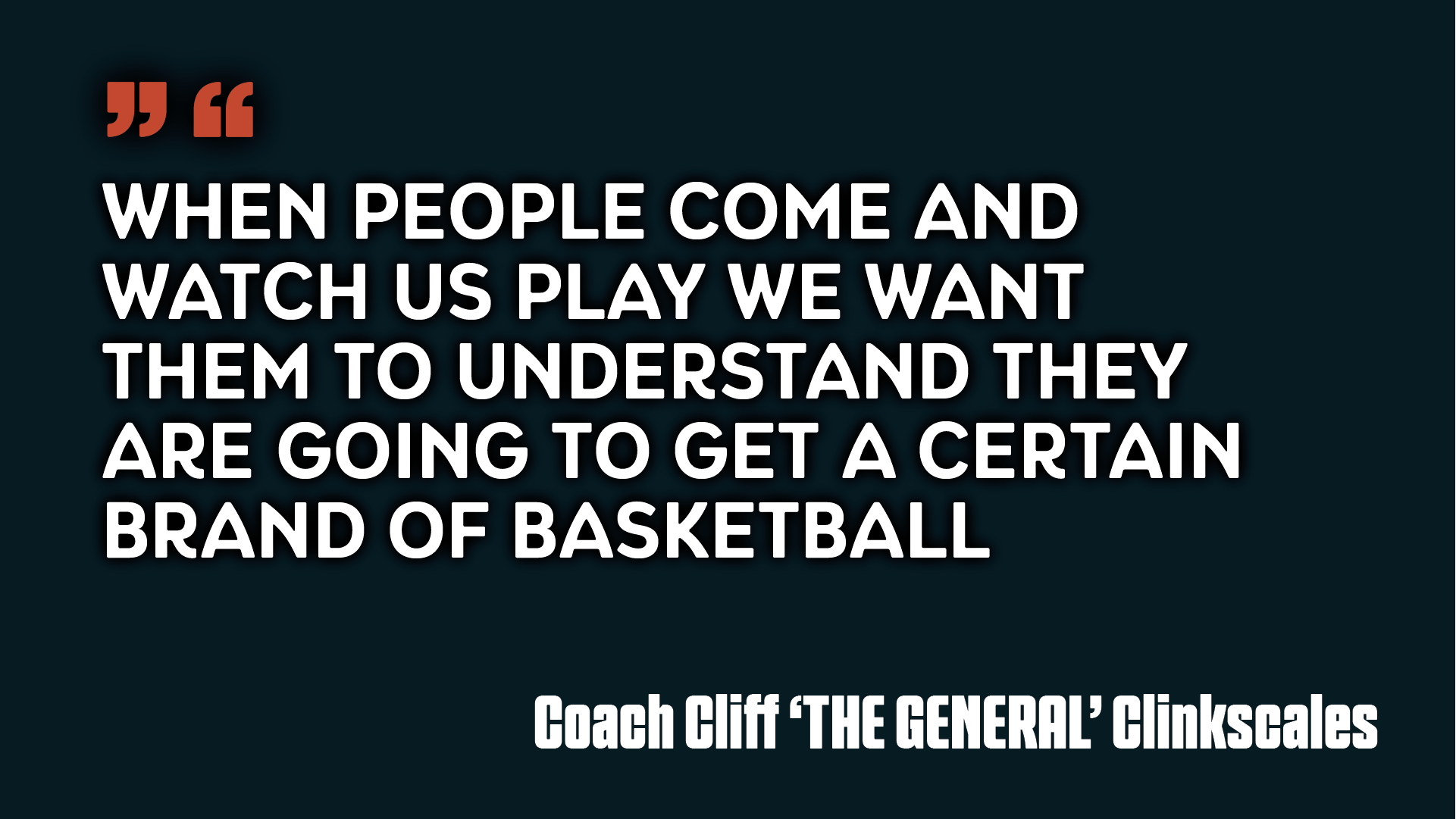
Coaches Fired Up for the New Era
- “When people come and watch us play, we want them to understand they are going to get a certain brand of basketball.” — Head Coach Cliff “The General” Clinkscales
- “The kitchen door is open! I’m ready to get started.” — Lead Assistant Coach James Robinson
- “Bold and modern, a new beginning — we’re comin’ in fired up!” — Coach of Individual Player Development James Siakam
At Studio Locale, we share the belief that KW is a sports town. Working at the intersection of design and sport. Two powerful forces that you will find in a united and strong community. Working with the Titans has been incredibly rewarding and being part of this story, helping to launch a new era for the Titans, is truly special.
Read more:
Want to create something unexpected with us?
Brutalism in Web Design: Function Over Fluff?
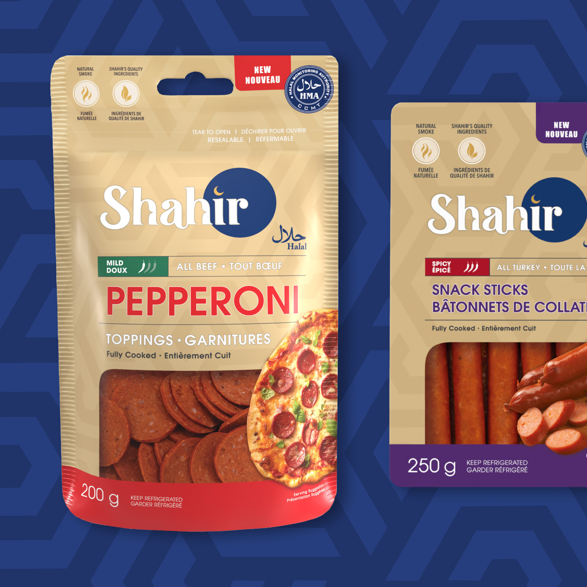
Shahir Halal Wins Best Halal Product of the Year 2025
Studio Locale is proud to highlight our client, Shahir Halal, for being recognized as Best Halal Product of the Year 2025. This award celebrates innovation, quality, and leadership within the halal food industry, reflecting Shahir Halal’s commitment to exceptional products and community trust.
The recognition underscores the company’s growing impact and dedication to standards that matter to both consumers and the broader food industry. Studio Locale congratulates Shahir Halal on this achievement and looks forward to seeing their continued influence in the market.
Read more: Shahir Halal – Best Halal Product of the Year 2025
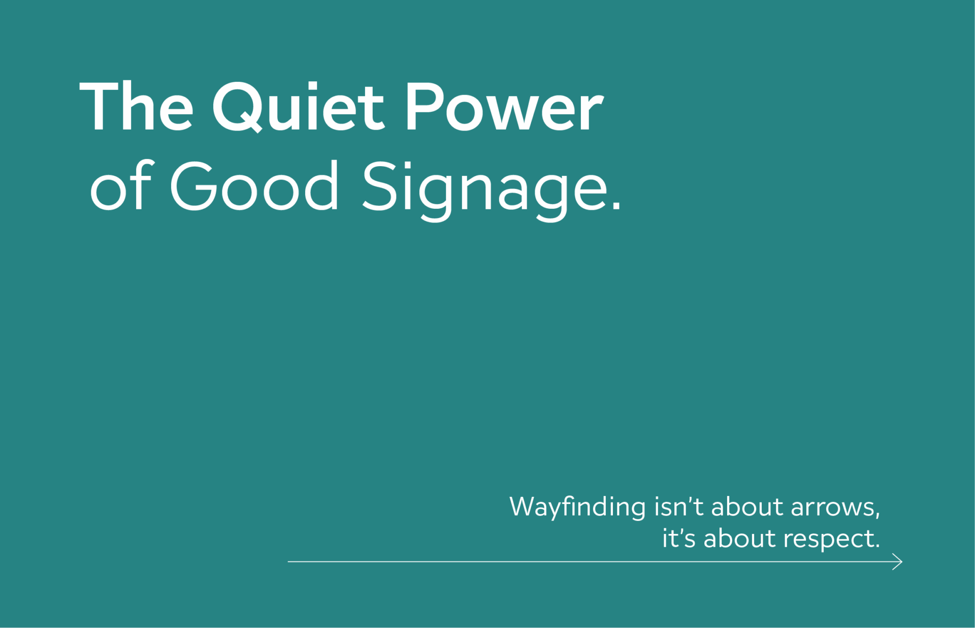
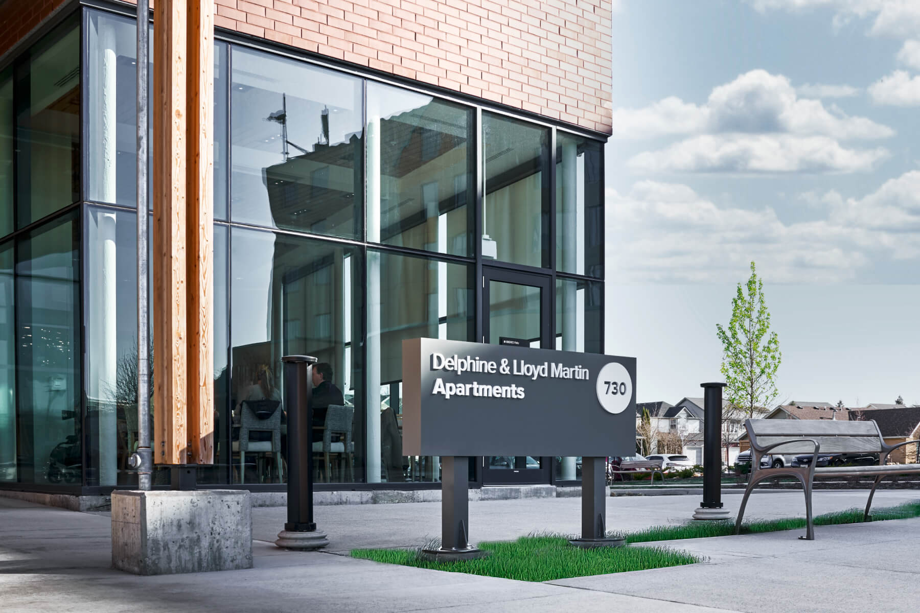
The Quiet Power of Good Signage
Let’s dispense with the idea that signage is merely functional. It isn’t. Good signage is graphic design at its most distilled — typography, iconography, material, and message — working in concert to tell you where you are, who’s speaking, and what kind of experience you’re about to have.
At its best, it’s placemaking made visible. It defines space, guides behavior, and communicates ethos. It’s the difference between wandering and arriving.
At its worst, signage is visual clutter.
Branding, Without the Billboard
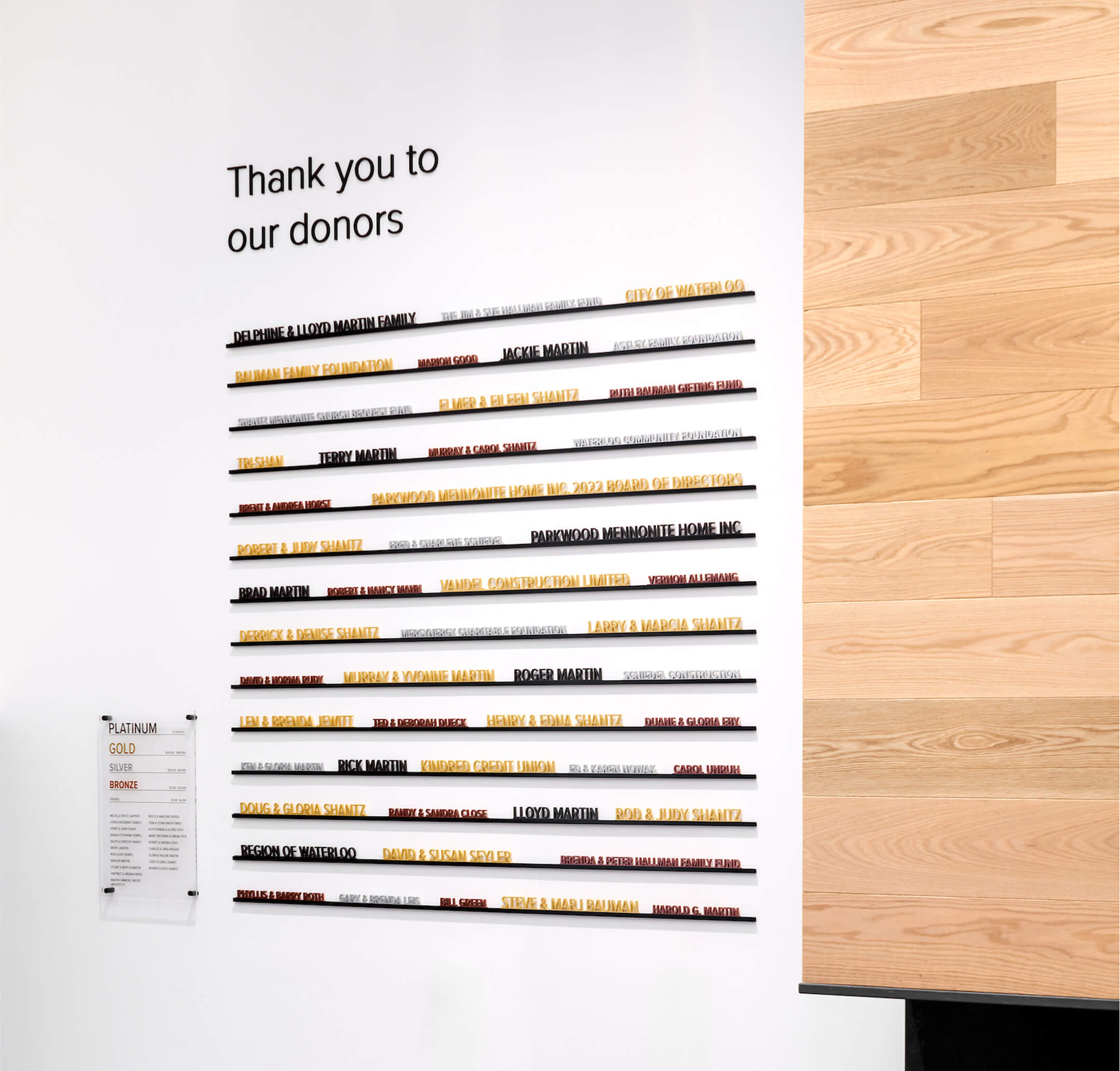
Strong brands don’t scream; they situate. They inhabit space through subtle cues: a specific shade of green, a sans-serif set just so, the honest materiality of wood or steel.
Signage, when properly integrated, extends the brand voice into the built environment without shouting for attention. It doesn’t just point to the brand; it is the brand.
Placemaking Begins with Legibility
Designing for place is more than aesthetics — it’s about hospitality. Signage anchors people in a space, but also invites exploration. It transforms “here” into somewhere.
When done well, signage contributes to the psychological map we carry in our minds: the comfort of knowing where you’re going, and the pleasure of getting there intuitively.
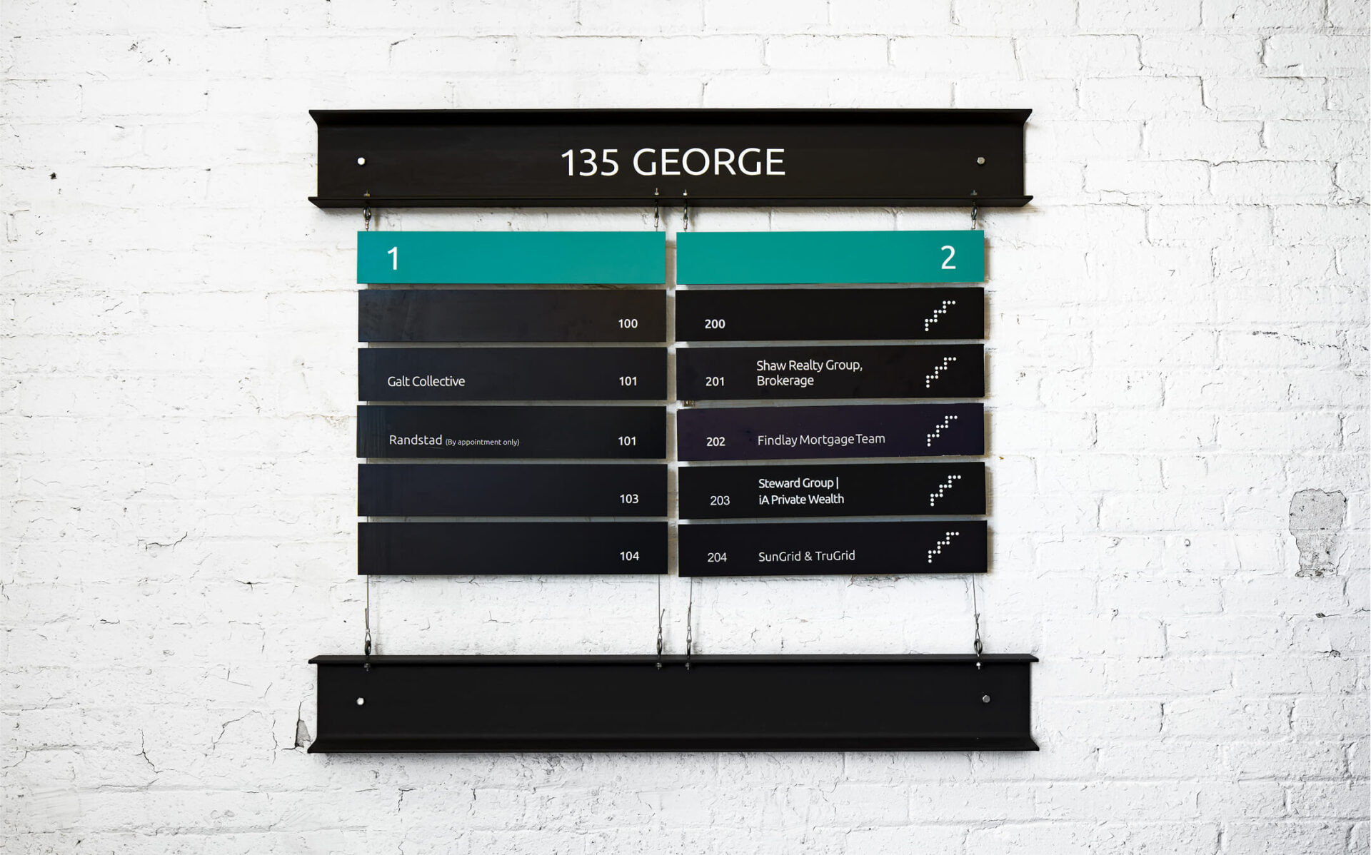
Accessibility Isn’t Optional
This should go without saying but too often, it doesn’t: signage must be accessible. Not because it’s a regulation (though it often is), but because it’s a human right.
Typography should be legible at a glance. Contrast ratios must support readability for all. Symbols should transcend language without becoming generic. Design is democratic, or it fails.
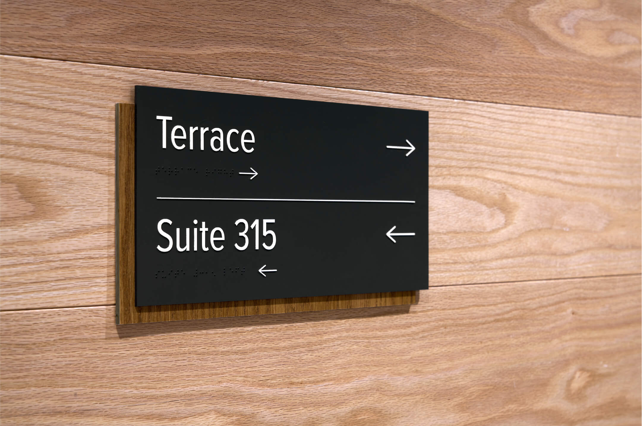
The Best Signage Disappears
You know it when you see it; or rather, when you don’t. That’s the paradox. The most effective signage often goes unnoticed because it works.
It eases tension, smooths transitions, and quietly affirms that someone thought carefully about how you’d move through the space.
In the end, good signage is not just a sign of a brand. It’s a sign of respect; for design, for place, and for the people who inhabit both.
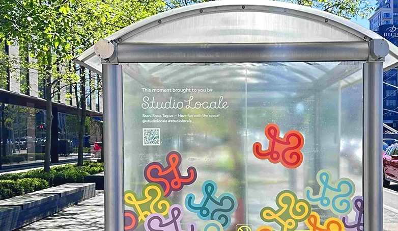
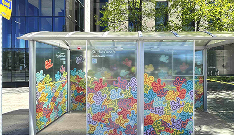
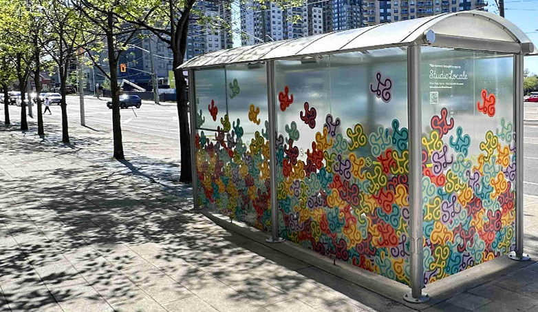
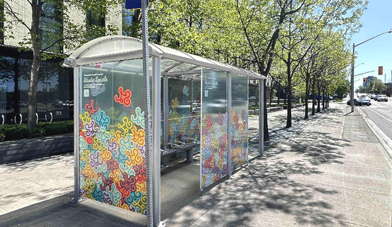
Studio Locale turns a bus shelter into a pop of joy
At Studio Locale, we believe branding should do more than sell—it should connect. And sometimes, it should simply surprise.
That’s the idea behind our latest project: a full takeover of a local bus shelter, transformed into a vibrant, artistic experience that brings a moment of colour to people’s everyday routine.
Working with GRT and Pattison Outdoor, we designed a wraparound visual installation that reframes the shelter as a public canvas. This is more than decoration; it’s a chance for people to pause, smile, and feel something unexpected.
“People are overwhelmed by noise, algorithms, and sameness…”
Philip Mondor RGD, Partner/Creative Director at Studio Locale
This project is also a direct response to a question we hear often: Why don’t more design studios advertise themselves?
So we decided to lead by example.
By using our creative strategy, media expertise, and bold design thinking, we’re showing exactly how powerful it can be to step outside the expected.
“Our approach invites pause. It’s a reminder that when brands connect on a human, emotional level, they build something much more powerful than recognition—they build relationships.”
We believe traditional formats, paired with digital and experiential thinking, can create meaningful brand moments that linger long after someone’s moved on.
This shelter is just one instance of that idea brought to life. It’s a small but vivid way of showing how art, design, and strategy can come together to shape how people see and feel about a space (and a brand).
Want to create something unexpected with us?
Fighting sameness
Think you have what it takes to put out original advertising and marketing campaigns? It’s not for everyone. Trying something different can be risky. Wondering off the path of what others are doing could land really great, or could stand out in a way you’d rather forget.
Building a marketing campaign that’s fighting sameness from others in your space, when done smartly, has its rewards with a great payout.
There’s a feeling of sameness in the ad space that a lot of people are seeing. You’re sure that you’ve read that headline before but can’t place from where; or saw the same models used for that ad’s perfect family in the article you just read yesterday.
There’s a formula being used and it’s pretty easy to spot. Yep, marketing and advertising 101 best practices tell us to include a headline, supporting imagery, and a call to action. Those are critical elements of a campaign and its ads, and are not what’s being referred to here. Instead it’s the execution of those components that’s become predictable.
Need a headline? ChatGPT or CoPilot (aka synthetic word extruders) can provide a fistful in a matter of seconds. Need an atmospheric image to place your slogan and logo next too? No problem with stock sites having an overwhelming number of city agnostic photos that you can use.
As a result, the same approach and sources are being used to create campaigns, making the world of ads and marketing feel flat. And why some of us are working hard to fight sameness.
Think you have what it takes to put out original advertising and marketing campaigns? It’s not for everyone. Trying something different can be risky. Wondering off the path of what others are doing could land really great, or could stand out in a way you’d rather forget.
Building a marketing campaign that’s different from others in your space, when done smartly, has its rewards with a great payout.
There’s a feeling of sameness in the ad space that a lot of people are seeing. You’re sure that you’ve read that headline before but can’t place from where; or saw the same models used for that ad’s perfect family in the article you just read yesterday.
There’s a formula being used and it’s pretty easy to spot. Yep, marketing and advertising 101 best practices tell us to include a headline, supporting imagery, and a call to action. Those are critical elements of a campaign and its ads, and are not what’s being referred to here. Instead it’s the execution of those components that’s become predictable.
Need a headline? ChatGPT or CoPilot (aka synthetic word extruders) can provide a fistful in a matter of seconds. Need an atmospheric image to place your slogan and logo next too? No problem with stock sites having an overwhelming number of city agnostic photos that you can use.
As a result, the same approach and sources are being used to create campaigns, making the world of ads and marketing feel flat. And why some of us are working hard to fight sameness.

See what we mean?
Variations of these two ads are pretty common to see. There is nothing in them that is fighting sameness making them easily recognizable as one specific brand.
And when people are walking or scrolling by, they see this

Want your ads to be more memorable?
Avoid your campaign falling into the ad-abyss by building these components into it
- Make an emotional connection that’s relatable and real, exploring all of the potential feelings (emotional ≠ sappy)
- Show how you are different through features, values, branding, or all of the above
- Use your own language and images where you can. It makes your brand distinct and harder to copy
Effective campaigns are creative, memorable and make an emotional connection. Lack those, and your campaign will lose in fighting sameness in the brandscape.
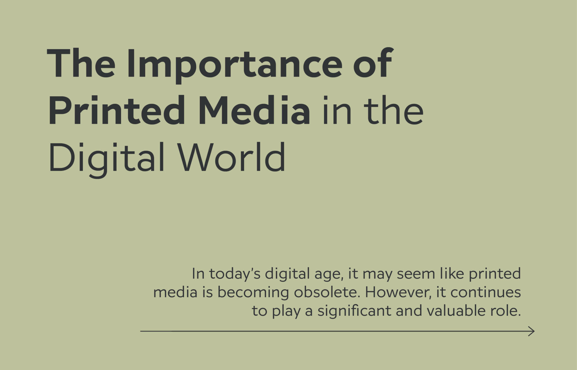
The Importance of Printed Media in the Digital World
In today’s digital age, it may seem like printed media is becoming obsolete. With the prevalence of smartphones, tablets, and laptops, many people believe print is a thing of the past. However, despite the rise of digital platforms, printed materials continue to play a significant and valuable role.

The Tangibility Factor
One key reason print endures is its tactile nature. In a world overwhelmed by screens, the experience of holding a book or flipping through a magazine is unique. Many people find that interacting with print fosters a deeper connection with the content. It’s an immersive, sensory experience that digital media can’t replicate.

Credibility and Trust
Print also carries a sense of credibility and trust. In an era of fake news and misinformation online, printed media is often perceived as more trustworthy. Editorial standards in print are typically higher, and many readers feel more confident in what they’re reading, as print publications undergo thorough editing and fact-checking.

Print in Marketing
For businesses, print offers an opportunity to stand out. In a digital world full of ads, physical materials like brochures and catalogs can create a more personal connection with customers. Direct mail campaigns, for example, often generate higher engagement and a longer-lasting impact than their digital counterparts, which can get easily lost in crowded inboxes.

Information Retention
Print remains a powerful tool in advertising. Studies show that consumers retain information better when engaging with print materials compared to digital ads. Printed advertisements also help reinforce brand identity, build trust, and create lasting impressions, making them an essential component of a comprehensive marketing strategy.
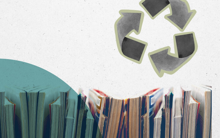
Sustainability and Print’s Evolving Role
The print industry has made strides in sustainability. Many publishers use recycled paper, eco-friendly inks, and green materials, making print more environmentally responsible. While digital content can be energy-intensive, print can be considered more sustainable when produced responsibly.
The Future of Print: Coexisting with Digital
Rather than being outdated, printed media is finding its place alongside digital content. Both formats have their strengths—digital excels in quick access and interactivity, while print offers depth, permanence, and a tangible experience. Print continues to thrive in a digital world, offering a unique and valuable complement to digital platforms.
In conclusion, despite the dominance of digital media, printed materials continue to hold significant value. Whether it’s the tangible experience, trust, marketing impact, or educational benefits, print remains an essential medium in today’s world.
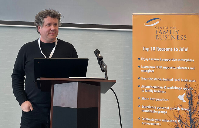
'What’s your story and how are you telling it?' – Phil’s talk at the CFFB
Phil recently had the opportunity to do a presentation at The Centre for Family Business, where he spoke about what makes a good business story and why it can be a huge asset for your brand.
Here are some of the key take-aways!
A good business story can be a huge asset to your brand.
It can position you well against your competitors. It can help you connect with your target customers. It can give people insight to your core values. It can demonstrate your commitment to something.
But your story may be different than what you might first think it to be.
At Studio Locale, we approach a story a bit different from what some might expect, because we feel it’s more than what you might think it is. It’s not just your origin story. While that may be interesting to some, it’s likely not the core reason why someone chooses to work with you.
People often think a company brand is “just” the logo.
But a brand is much more than that. Your logo may be the picture that pops into someone’s head when they think of your company, but your brand is really the sum of all of the different touchpoints it has with the world. Your brand story is exactly the same. It’s not just what you have on the About page of your website, it should be on every touchpoint you have with your clients.
Are you memorable?
The other thing to be aware of is that people only have so much capacity to remember. Our brains have a “memory slot” for all the different things that we might need to remember, and most of us have a lot going on in our heads.
But when we have a moment of calm, we want there to be a clear picture, or story, for people to remember your company. We want your story to help people catalogue your company as the one they remember for that slot in their brain.
So before your ‘story’ is shared, stop and consider what part of your story matters to your clients. What part adds to the value you offer customers, what part helps you differentiate yourself from your competitors, and how easy it is to remember.
What matters to your clients?
Many companies are sharing the “Canadian” part of their story right now, and understandably so. We all want to do our part to support fellow Canadians, so it’s thinking how that offers value to your customers, or differentiates yourself from your competitors. If there are other Canadian companies in the mix, it’s not a story that is going to necessarily be enough on its own.
Once you know what your story is, you can begin getting it out into the world. Remember you want it to be clear; you want it to be easy to understand; and you want to share it consistently everywhere.
A good test to tell how clear your brand story is – Do others say the same thing? What do your employees say? What about your partners or suppliers? You may have brand ambassadors? And most importantly, your clients. Fingers crossed they are all saying some variation of your story, building up a really solid brand experience.
Our Brand Story
We are a branding and marketing agency here in Kitchener and we’ve been quietly working away at building brands for more than 10 years. We really love building brands and marketing companies who are working to get to the next level – whatever that might be for them.
That’s our story. Digging deep to help our clients succeed.
So when we talk about weaving your brand story into all of your touchpoints, we’ve practiced what we preach and we started at the beginning when we developed our name.
What’s a locale?
The definition of locale is an area or place, especially one where something special happens. It creates the setting for the story to begin. It sets the tone and establishes the mood. When we are working with our clients, we immerse ourselves into their world, digging deep to understand their values and culture, their industry, their clients, to set the foundation for THEIR story to be told through their branding, website and marketing materials.
That’s why if you take a look at our work, you won’t see a ‘house style’, or ‘trending’ designs across every project, because that’s not what works for our clients in their space.The role of our team is to work with our clients to figure out what their story is, why it matters to their customers, and how that sets them apart from the rest of companies they are competing with.
To conclude…
If your story is consistent across each interaction and moment, can be clearly understood, and resonates with your clients, then it’s contributing as an effective brand tool in your larger brand toolbox.
Studio Locale’s Robin Mondor Discusses the ‘Open’ Program on the Mike Farwell Show
Robin joined Mike on the Mike Farwell Show to discuss our “open” program, which offers local nonprofits a week of pro bono design, marketing, and development support. We’re thankful for the chance to highlight our commitment to giving back and helping organizations overcome challenges. Thanks, Mike, for the opportunity!
M: In studio guests are some of my favourite guests, and somebody that I have communicated with many times over the years is finally in studio sitting across from me, Robin Mondor, the owner at Studio Locale. Good morning. Thanks for being here.
R: Thanks for having us, Mike.
M: Tell us a little more about Studio Locale and what you do there.
R: Yeah. For sure. So we are a branding and marketing agency here in Kitchener Waterloo, and we focus on helping our clients kind of hone in on their messaging and communications and brand to kinda get them to the next level. So that’s really our passion and that’s what we do. We have a wide range of different clients that span all sorts of different industries and different points in their timeline and where they are with their business. So we just kinda jump in and help them.
M: Yeah. And that help that you do has been so successful and so highly regarded. That’s how our paths have kind of crossed electronically Yep. Over the years.
M: But what I love about the purposes of today’s conversation, Robin, is your emphasis on giving back as well, helping out nonprofits that may need some support in that space.
R: Yeah, it’s a tricky time for sure for nonprofits, and I know a lot of them are kinda feeling the pinch from provincial and federal funding or potentially philanthropic funding, and everyone else is feeling the pinch. So, we have a program called Open, and we’ve had it informally for a number of years. We’ve always given back to our community through different projects and different groups that have reached out, but this has kind of formalized it over the last few years.
So we’re excited to do that. We dedicate an entire week and give a full week of design, marketing, and development time to a not for profit who’s looking for some extra support.
M: And what a happy coincidence that the organizations that you were able to support last year are two that are very near and dear to my heart, the, Gault Curling Club in Ayr.
R: In Ayr. Yes.
M: Right? Or the Ayr Curling Club. Yes. Yeah. And I I say that because buddies of mine that I played ball with in the summer started curling in the winter, and that’s where they curl on Broom Street in Ayr. And I could never join because I’m too busy with my hockey season, but they have thoroughly enjoyed it. And then ink stained wretches and my buddy, Mirko, and the hard work that they do. But how were you able to support the air curling club and ink stained wretches?
R: Well, with Ayr Curling, so they wanted to kinda become more of an inclusive group, and so they wanted to drop the name or the the term club from their name. So they’re simply now Ayr Curling and wanted to refresh their identity to reflect that. So they had an older, very traditional looking logo and wanting to have with the name change, have something that visually made it feel like it was more open and accessible to everyone in the community.
M: So why is it important to you, Robin, as a business owner to give back in this way?
R: I think everyone’s kind of looking for an opportunity to give back. And I think for ourselves, because our focus is on marketing and communications and helping make connections with, our clients’ target audiences, not for profits are looking for help in that making that connection. And so it was really it felt like something that was kind of a no brainer to make that connection with our with our not for profits in the community to help them connect. Where are they struggling? Is it are they struggling to reach, from a fundraising perspective? Is it, you know, connecting with theirs their community and who they’re looking to support? So it just kinda felt like a natural fit.
M: So I’m sure there is an application process that goes along with this because as much as you would love to, you can’t do it for everybody. How can a local not for profit apply for open?
R: Yes. So we have a web page on our website, studiolocale.com/open. And on there, there’s an application form. Because it is just for one week, we run it really, really quickly. It’s almost like a sprint to folks who are familiar with that term. So we’re starting typically on a Monday and wrapping up on a Friday. So we ask the not for profits to kinda be a little bit prepared for that week and come in so that we can hit the ground running. So we wanna know as much as we can about what you’re looking to do, where your challenges are, where there’s an opportunity for us to potentially help. And then that way, when we start off the project, we’ve got everything that we need, and we can really start getting into the details of it versus trying to understand more.
M: Are there any parameters around the organizations that are eligible to apply?
R: So what we say is we like to focus on organizations that support youth, equality, and social responsibility. But I think if you think about it, that’s almost every sort of not for profit. So there’s a lot of flexibility in terms of who we’re looking or who we could potentially help. It’s really how folks are sharing their information with us that helps our team decide who we’re gonna work with.
M: And once those applications start coming in, Robin, are you able to work out a mutually convenient time for the organization to let you in the doors for that sprint that given week? Or do
R: yeah. We try to do it typically in June. Okay. We find that if we wait a little bit later, we start getting into people being on vacation and away for the summer. And then in the fall, a lot of not for profits are ramping up into their end of year fundraising activities. So that time frame seems to work for most folks. Obviously, again, we’re flexible. So if it really is gonna be a pinch, we can talk about different time frames. But for the most part, that seems to work before people head off for the summer.
M: Alright. I wanna point folks in the direction of studiolocale.com/open. That’s where you’ll learn more about the program. You can fill out the twenty twenty five application form because I’m looking at it right now. Easy to find. And, one of our local nonprofits can get some support from Studio Locale in that week long sprint. Thanks for the work that you do, Robin, and thanks very much for being with us on the show today.
R: Thanks for having me, Mike. We really appreciate it.
M: Robin Mondor, the owner at Studio Locale. Again, check out studiolocale.com/open.
Managing your online product catalogue through your website
When your dealer network relies on your online product catalogue as a sales tool, you want managing it and keeping it up to date to be easy and quick.
Hanstone is a Canadian manufacturer of custom-made, solid wood furniture and since 1999, they have remained a family-owned business building furniture that’s crafted for life.
With more than 25 lines for all areas of the home, their website is the primary sales aid for its dealer network. The site’s online product catalogue is used by the dealers and their customers when selecting woods, stains, finishes and hardware across their furniture lines. With literally hundreds of combinations, the online pages are a critical component when a client is finalizing their custom order.
Handstone’s online product catalogue has been in existence for more than 12 years. A custom built website, the public facing pages of the site follow the sales journey as it would in store. Furniture lines are presented by collection or room, with custom finishing options easy to find and select. The site was built for the Handstone team to easily upload new product lines and finishing options, update their dealer locator, as well as furniture care tips and tricks videos and other support information.
When it came time to refresh the overall appearance of their website and upgrade the development platform, the forethought into the initial site saved the Handstone team considerably, eliminating the need to rebuild the product management section and re-enter all of the furniture and options available. The visual redesign allowed for larger product photos and gave the entire experience a more contemporary feel.
With an updated online product catalogue, Handstone is well positioned and set to continue building furniture that’s made to last.
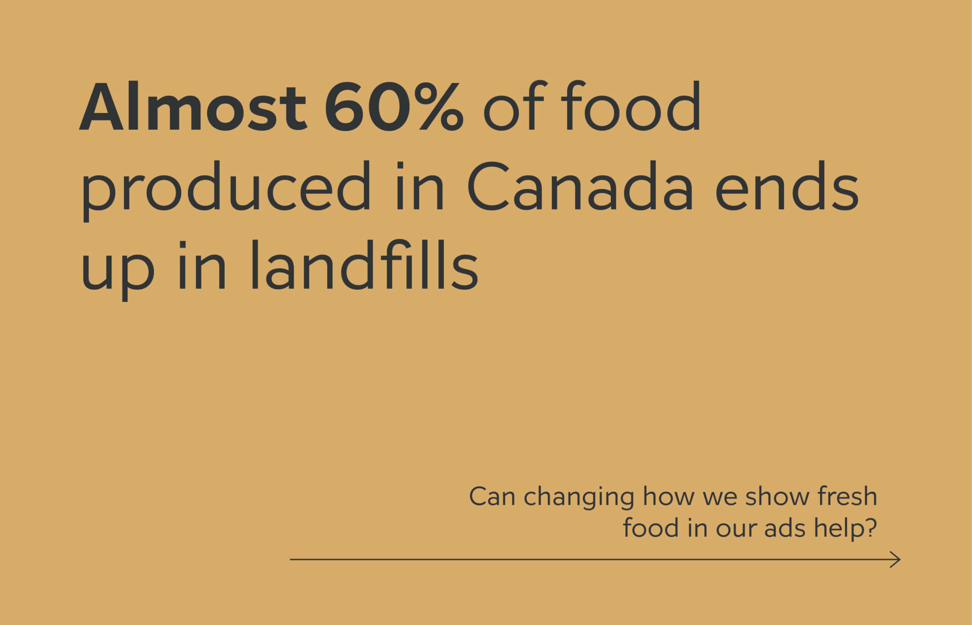
Perfectly imperfect food in advertising
Show my the ugly food! Not the rotten, inedible, or otherwise nasty food, but the perfectly imperfect, still good to eat food.
With almost 60% of food produced in Canada going into landfills, or never even making it to stores or markets, we need to change how we look at and select our fresh food. And very possibly it begins with those of us responsible for marketing that food.
Since the beginning, the most perfect fruits and vegetables have been chosen to showcase in ads to demonstrate their quality. And even those were not deemed perfect enough, being colour corrected and adjusted before the final ad was published.
Some campaigns have embraced a crazy idea – showing foods that are not 100% perfect, but still 100% perfectly good to eat! However we are so conditioned to look for that idyllic piece, that messaging is needed to show that the food is still good to eat.

A number of retailers and producers sell it at a discounted rate as well, as though these imperfect harvests were lesser than their more attractive versions. (Check out the Inglorious Fruits & Vegetables campaign, the Naturally Imperfect line introduced by NoName, and even the addition of googly eyes to ugly produce to help move it off the shelves.)
As marketers and designers, can we not lead an acceptance of the imperfect and include these in our ads and images? Can we do it without calling out the use of imperfect food to make it just seem normal!? It is how our food naturally grows….
If the change is subtle and progresses overtime, could we all move towards a taste of all shapes, sizes and colour variations for our food and reduce food waste?